Seurat is an R package for single cell RNA SEQ data processing, exploration and analysis.

catalogue
#Identify genes with highly variable characteristics
#Linear dimensionality reduction and visualization
#Nonlinear dimensionality reduction
#Identify cell types in clusters
At seurat4 In version 0, comprehensive multimodal analysis is added, and weighted nearest neighbor analysis is used to define cell state; The fast comparison method between data sets is also added, and Azimuth is introduced, that is, high-quality reference data sets are used to quickly map new scrna SEQ data sets.
The following is a tutorial on the official website( https://satijalab.org/seurat/articles/pbmc3k_tutorial.html )Take Seurat as an example to get familiar with Seurat.
In the course, 2700 single-cell peripheral blood cell data generated by second-generation sequencing were analyzed.
Original data download address https://cf.10xgenomics.com/samples/cell/pbmc3k/pbmc3k_filtered_gene_bc_matrices.tar.gz https://cf.10xgenomics.com/samples/cell/pbmc3k/pbmc3k_filtered_gene_bc_matrices.tar.gz
#Import R package
dplyr package contains pipeline function% >%, patchwork package can combine graphics, and the two assist Seurat package.
install.packages("Seurat")
library(Seurat)
install.packages("dplyr")
library(dplyr)
install.packages("patchwork")
library(patchwork)
#Create Seurat project
#Import data
pbmc.data <- Read10X(data.dir = "F:/bio/AU/AU1/Seurat/filtered_gene_bc_matrices/hg19")
#Construct the Seurat project on the original data -- filter the cells with less than 200 genes (min.features = 200) and genes covered by less than 3 cells (min.cells = 3) measured in the data set
pbmc <- CreateSeuratObject(counts = pbmc.data, project = "pbmc3k", min.cells = 3, min.features = 200)
#Data preprocessing
#Quality control (QC)
#QC indicators:
- unique feature of each cell -- low quality and empty droplet cells generally do not contain genes, and the cell's double or multiple body may show an abnormally high gene count.
- Total number of molecules detected in cells
- Reading rate matched with mitochondrial genome - low quality / dead cells often show mitochondrial contamination. Mitochondrial QC measurement can be calculated by PercentageFeatureSet() function
- Low quality / dead cells often exhibit extensive mitochondrial contamination
- All gene sets starting from MT - were used as a set of mitochondrial genes
pbmc[["percent.mt"]] <- PercentageFeatureSet(pbmc, pattern = "^MT-")
#Draw violin Diagram -- visual QC index to filter cells (filter cells with unique genes more than 2500 or less than 200 and mitochondrial count > 5%). nFeature_RNA represents the number of genes measured in each cell, nCount represents the sum of the expression of all genes measured in each cell, and percent.mt represents the proportion of mitochondrial genes measured
VlnPlot(pbmc, features = c("nFeature_RNA", "nCount_RNA", "percent.mt"), ncol = 3)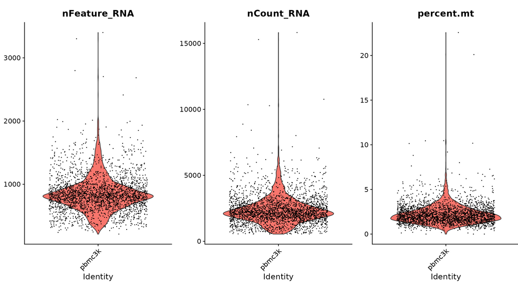
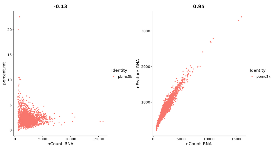
#Visualizing the relationship between features -- FeatureScatter creates a scatter diagram between two features
plot1 <- FeatureScatter(pbmc, feature1 = "nCount_RNA", feature2 = "percent.mt")
plot2 <- FeatureScatter(pbmc, feature1 = "nCount_RNA", feature2 = "nFeature_RNA")
plot1 + plot2
#Cells with unique genes lower than 2500 or higher than 200 and mitochondrial count < 5% were retained and stored
pbmc <- subset(pbmc, subset = nFeature_RNA > 200 & nFeature_RNA < 2500 & percent.mt < 5)
#Standardized data
The global scale normalization method is used to normalize the characteristic expression measurement of each cell, multiply it by a scale factor (10000 by default), and then logarithmically convert the results.
pbmc <- NormalizeData(pbmc, normalization.method = "LogNormalize", scale.factor = 10000)
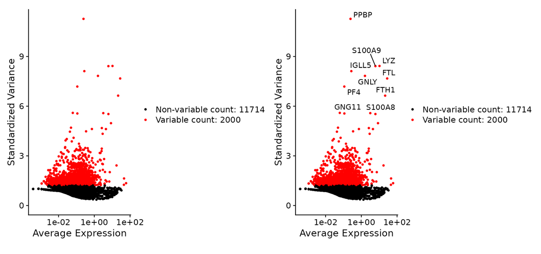
#Identify genes with highly variable characteristics
Genes with large differences in expression between cells were identified. The inherent mean variance relationship in single cell data is directly modeled by FindVariableFeatures().
pbmc <- FindVariableFeatures(pbmc, selection.method = "vst", nfeatures = 2000)

#The first 10 mutant genes were identified and preserved
top10 <- head(VariableFeatures(pbmc), 10)

#Visualization of highly variable cells
plot1 <- VariableFeaturePlot(pbmc)
plot2 <- LabelPoints(plot = plot1, points = top10, repel = TRUE)
plot1 + plot2
Taking me as an example, errors may be reported during drawing:
Error in grid. Call(C_convert, x, as.integer(whatfrom),as. Integer (who to): viewport has zero dimension (s) -- the view window may be too small. Adjust the view window
#Normalized data
The average expression between cells was 0 and the variance was 1.
all.genes <- rownames(pbmc)
pbmc <- ScaleData(pbmc, features = all.genes)

#Simplified method (only this step can be performed)
pbmc <- ScaleData(pbmc)
#Linear dimensionality reduction and visualization
pbmc <- RunPCA(pbmc, features = VariableFeatures(object = pbmc))
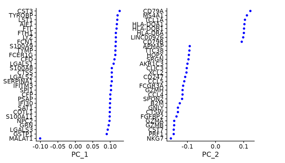
#Check and visualize PCA results in different ways -- there are three methods to visualize PCA results vizdimeducation (), dimplot (), and DimHeatmap() in Seurat package.
print(pbmc[["pca"]], dims = 1:5, nfeatures = 5)
VizDimLoadings(pbmc, dims = 1:2, reduction = "pca")
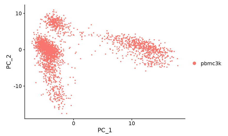
DimPlot(pbmc, reduction = "pca")
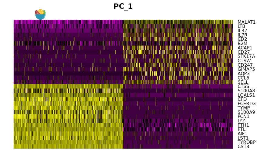
DimHeatmap() Cells and features are sorted according to their PCA scores. Setting the cell to a number can plot the "extreme" cells at both ends of the spectrum
DimHeatmap(pbmc, dims = 1, cells = 500, balanced = TRUE)
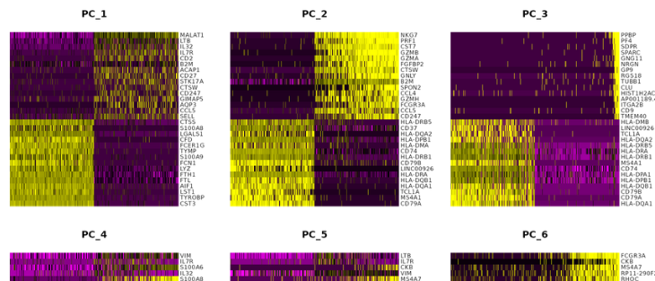
DimHeatmap(pbmc, dims = 1:15, cells = 500, balanced = TRUE)
#Determine data dimensions
Study pc to determine the relevant sources of heterogeneity.
Jackdraw() counts the statistical significance of PCA score and sets repeated sampling for 100 times.
ScoreJackStraw() calculates the score difference of Jackstraw.
pbmc <- JackStraw(pbmc, num.replicate = 100)
pbmc <- ScoreJackStraw(pbmc, dims = 1:20)
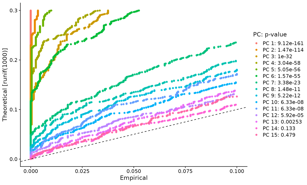
- # method 2 -- JackStrawPlot() -- compare whether the p-value distribution of each PC is uniform (dotted line). The statistical test based on random empty model is time-consuming for large data sets, and may not return a clear PC truncation value
JackStrawPlot(pbmc, dims = 1:15)
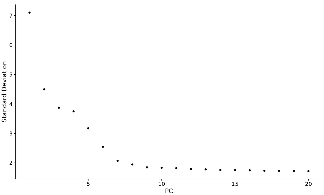
- Method 3 "elbow graph" -- ElbowPlot() sorts the main components based on the percentage of variance explained by each component. It belongs to a heuristic algorithm and can be calculated in real time
ElbowPlot(pbmc)
#Cell clustering
FindNeighbors() constructs KNN graph based on Euclidean distance in principal component space, and then defines edge weights between any two cells based on the shared overlap of adjacent regions. Input value: first 10 PCs
pbmc <- FindNeighbors(pbmc, dims = 1:10)
The shared nearest neighbor (SNN) method is used to identify cell clusters. The parameter is set between 0.4-1.2, which has good results for the data set of 3k cells. The larger the data set, the higher the optimal resolution
pbmc <- FindClusters(pbmc, resolution = 0.5)
Idents() to view the clustering results
head(Idents(pbmc), 5)
#Nonlinear dimensionality reduction
tSNE and UMAP are Seurat's nonlinear dimensionality reduction methods.
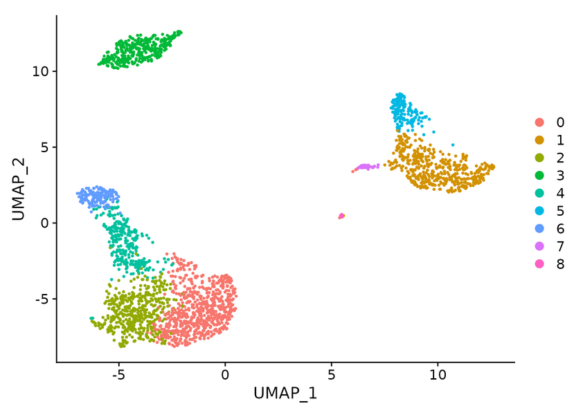
pbmc <- RunUMAP(pbmc, dims = 1:10)
head(pbmc@reductions$umap@cell.embeddings)  #Extract UMAP coordinate values
DimPlot(pbmc, reduction = "umap")  #The first choice of dimensionality reduction method is umap, then tsne, and finally pca
# find the characteristics of differential expression in clusters
Identify positive and negative markers in a single cluster
ident.1 parameter set the cell type to be analyzed. min.pct indicates the proportion of the number of gene expression in the total number of such cells, and find out all markers in cluster 2
cluster2.markers <- FindMarkers(pbmc, ident.1 = 2, min.pct = 0.25)
head(cluster2.markers, n = 5)
Find out the differential expression markers between cluster 5 and cluster 0 / 3
cluster5.markers <- FindMarkers(pbmc, ident.1 = 5, ident.2 = c(0, 3), min.pct = 0.25)
head(cluster5.markers, n = 5)
Markers for each cluster were found in all remaining cells and only positive sites were reported
pbmc.markers <- FindAllMarkers(pbmc, only.pos = TRUE, min.pct = 0.25, logfc.threshold = 0.25)
pbmc.markers %>%
    group_by(cluster) %>%
    slice_max(n = 2, order_by = avg_log2FC)
#The pipeline function% >% here needs to call the dplyr package, import the data on the left to the right, sort by cluster, and return AVG_ The highest 2 columns of variables in log2fc
The ROC test returns the "classification ability" of any single tag (ranging from 0 - random to 1 - perfect).
cluster0.markers <- FindMarkers(pbmc, ident.1 = 0, logfc.threshold = 0.25, test.use = "roc", only.pos = TRUE)
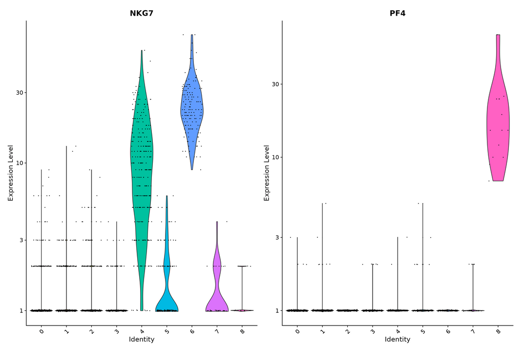
VlnPlot() and FeaturePlot() are used to visualize the sites of tSNE and PCA
VlnPlot(pbmc, features = c("MS4A1", "CD79A"))
VlnPlot(pbmc, features = c("NKG7", "PF4"), slot = "counts", log = TRUE)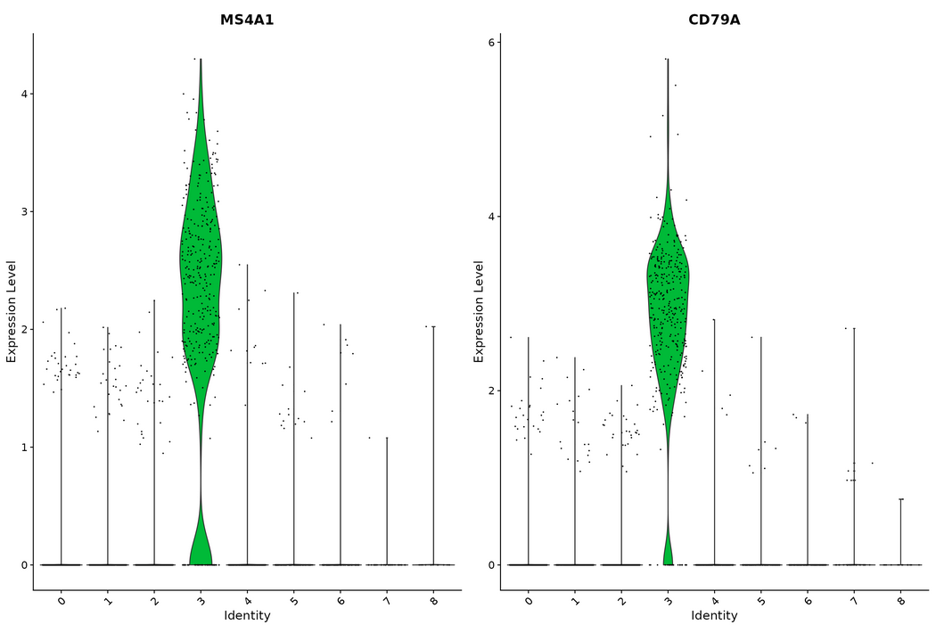
FeaturePlot(pbmc, features = c("MS4A1", "GNLY", "CD3E", "CD14", "FCER1A", "FCGR3A", "LYZ", "PPBP", "CD8A"))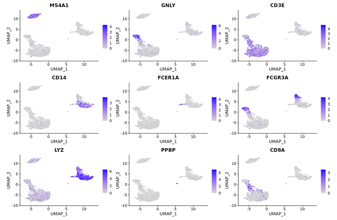
DoHeatmap() generates an expression Heatmap for a given cell and feature
pbmc.markers %>%
    group_by(cluster) %>%
    top_n(n = 10, wt = avg_log2FC) -> top10
DoHeatmap(pbmc, features = top10$gene) + NoLegend()
#Generate the expression heat map of top10 gene and remove the legend
#Identify cell types in clusters
new.cluster.ids <- c("Naive CD4 T", "CD14+ Mono", "Memory CD4 T", "B", "CD8 T", "FCGR3A+ Mono",
    "NK", "DC", "Platelet")
names(new.cluster.ids) <- levels(pbmc)
pbmc <- RenameIdents(pbmc, new.cluster.ids)
DimPlot(pbmc, reduction = "umap", label = TRUE, pt.size = 0.5) + NoLegend()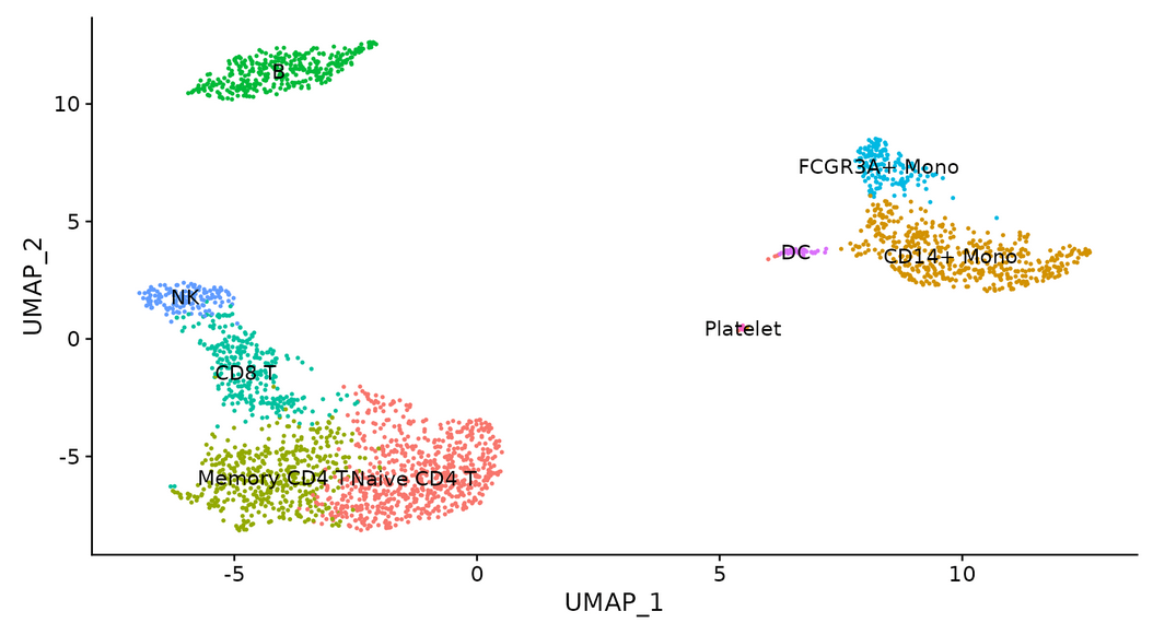
saveRDS(pbmc, file = "../output/pbmc3k_final.rds")
The basic usage of Seurat is shown above.
Please criticize and give advice.