preface
in the previous chapter, we mainly introduced through fig.add_subplot() and fig.add_ The second method can flexibly realize the picture layout of any format. This paper will introduce other layout methods, so that you can get the layout you want faster in the actual drawing process.
1, Drawing layout
1.1 sub Atlas (plt.subplots())
before, we used add on Figure_ In fact, we can use the subplots function in pyplot to quickly create multiple subplots of Sketchpad Figure. The syntax is as follows:
plt.subplots(nrows=1, ncols=1, *, sharex=False, sharey=False, squeeze=True, subplot_kw, gridspec_kw)
here are the main parameters:
- nrows: number of rows
- ncols: number of columns
- sharex and sharey: indicates whether the xticks and yticks of these subgraphs are the same. The default value is False
- Squeeze: indicates whether the array format of the returned subgraph object is compressed, that is, squeeze=True. If the number of rows is 1 or the number of columns is 1, the subgraph object is returned in one-dimensional array format (1DArray), and squeeze=False. Even if the number of rows is 1 or the number of columns is 1, the subgraph object is still returned in two-dimensional array format (2DArray). The following will use an example to explain how to operate the subgraph with the array format of the returned subgraph object.
- subplot_kw: pass parameters to add in dictionary format_ Subplot(), for example, you can transfer parameters such as color. See add for details_ subplot().
- gridspec_kw: pass parameters to MPL in dictionary format gridspec. Gridspec() is used to create the grid placed by the subgraph. Gridspec here is another important Sketchpad layout class in matplotlib, which will also be introduced below.
we often use PLT in these two ways Subplots() create Sketchpad and sub Atlas:
#Method 1:
fig,((ax1,ax2,ax3),(ax4,ax5,ax6),(ax7,ax8,ax9))=plt.subplots(3,3,sharex=True,sharey=True)

#Method 2:
fig,axes=plt.subplots(3,3,sharex=True,sharey=True)
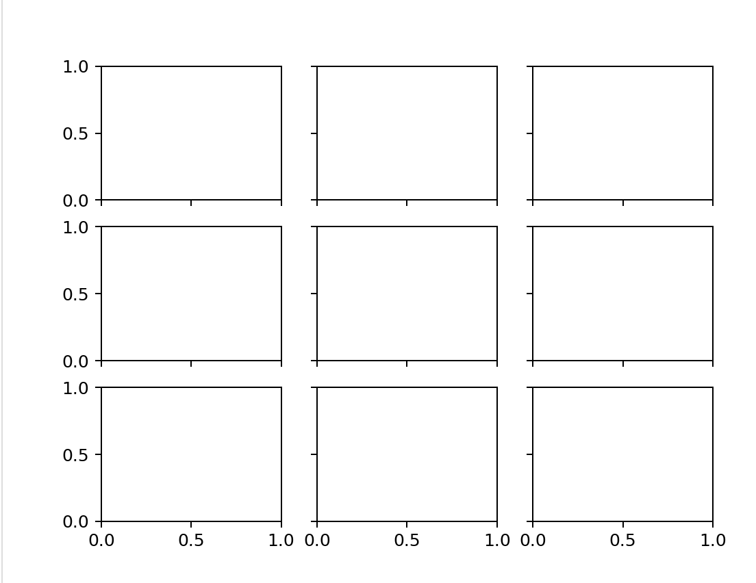
obviously, both methods can get the drawing board fig and the sub atlas. The difference is that we can use the 3 * 3 tuple to name these sub atlas one by one, such as method 1, and then directly use these names to operate the corresponding sub graph; Like method 2, you can also use axes to represent the whole sub graph set, and then you can operate the sub graphs in the sub graph set according to the call in array format.
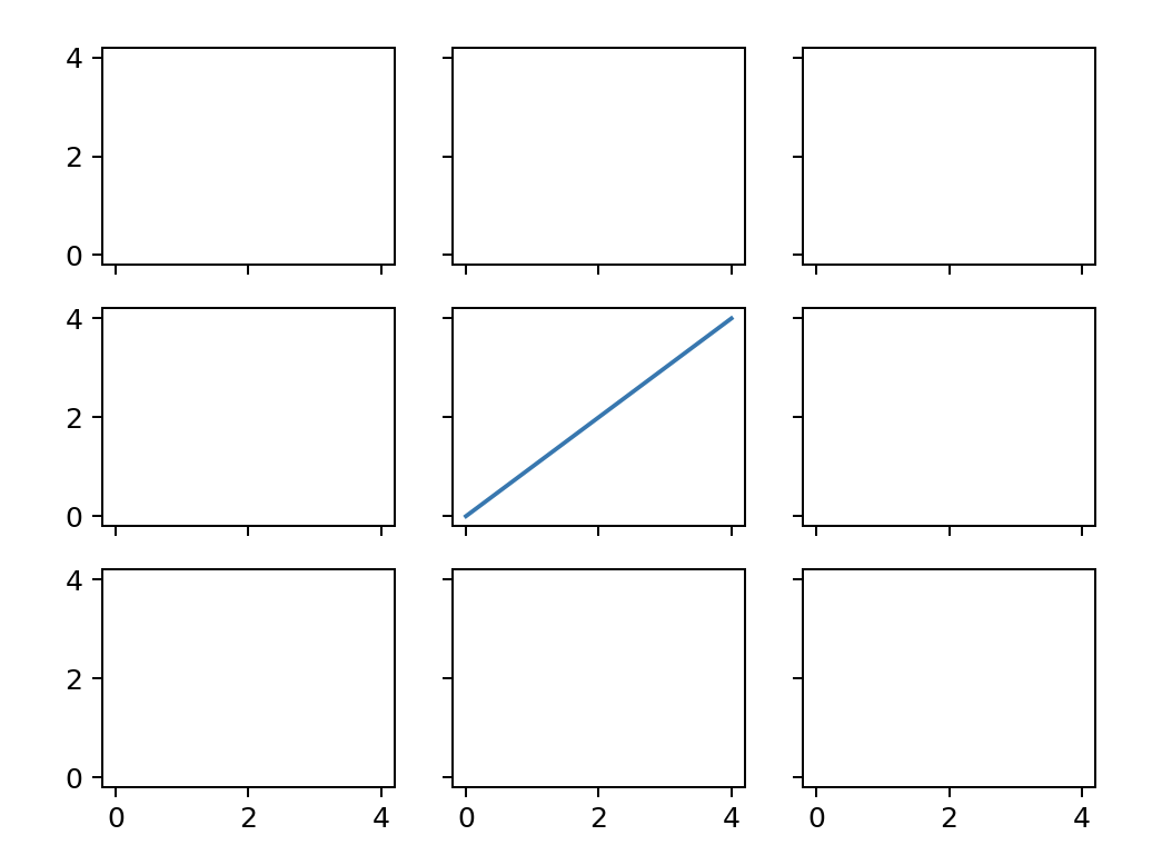
for example, we need to draw a straight line for the middle subgraph. The drawing statements of the two methods are as follows:
import numpy as np
pos=np.arange(0,5,1)

Method 1:
ax5.plot(pos)
Method 2:
axes[1,1].plot(pos)
for method 1, it's easy to understand. For method 2, this calling method essentially regards axes as a two-dimensional matrix, and axes[1,1] represents the second row from top to bottom and from left to right (coordinates start from 0). Looking back at the squeeze parameter, the default value is True, which means that if you make a 2 * 1 subgraph, it will return a one-dimensional matrix. You can't use axes[0,0] to get the first subgraph, but axes[0].
- Adjust the spacing between subgraphs
plt.subplots_adjust() can be used to adjust the size of subgraphs, or the row spacing and column spacing between subgraphs, as follows:
plt.subplots_adjust(wspace = 0.0,hspace = 0.0)
for ax in plt.gcf().get_axes():
    ax.tick_params(bottom=False,left=False)
in this way, the row spacing and column spacing between subgraphs can be adjusted to 0.
if you think the internal scale axis is too redundant, you can use tick_params(), the syntax is shown below.
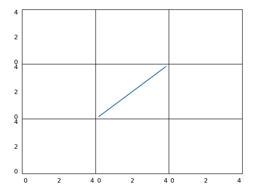
- Solve the problem that the axis scale of internal subgraph is not visible
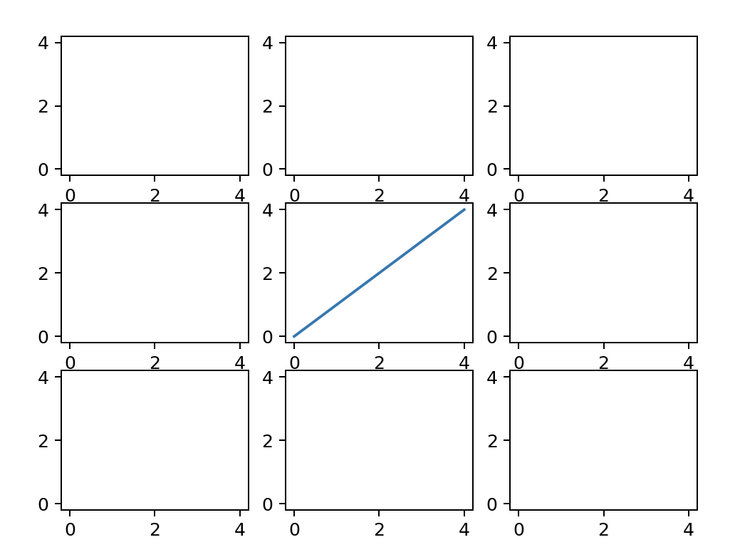
as shown in the above figure, we found that if the x-axis scale and y-axis scale are shared, matplotlib will automatically hide the internal scale of the subgraph. This problem bothered me for some time. In the old version of matplotlib, just set the left and lower xticklabel s of each subgraph to be visible, as follows:
for ax in plt.gcf().get_axes():
    for label in ax.get_xticklabels() + ax.get_yticklabels():
        label.set_visible(True)
plt.gcf().canvas.draw() #Some editors need to run this statement again to realize painting
but not in the new matplotlib (I use version 3.6.0). Finally, I set the tick of the corresponding axes_ Params () solves this problem. The parameters left, right, top and bottom in params () represent the scale mark, while labelleft, labeltop, labelright and labelbottom represent the scale label. Unlike the display, it can be set to False. The example code is as follows:
for ax in plt.gcf().get_axes():
    ax.tick_params(labelbottom=True, labelleft=True)
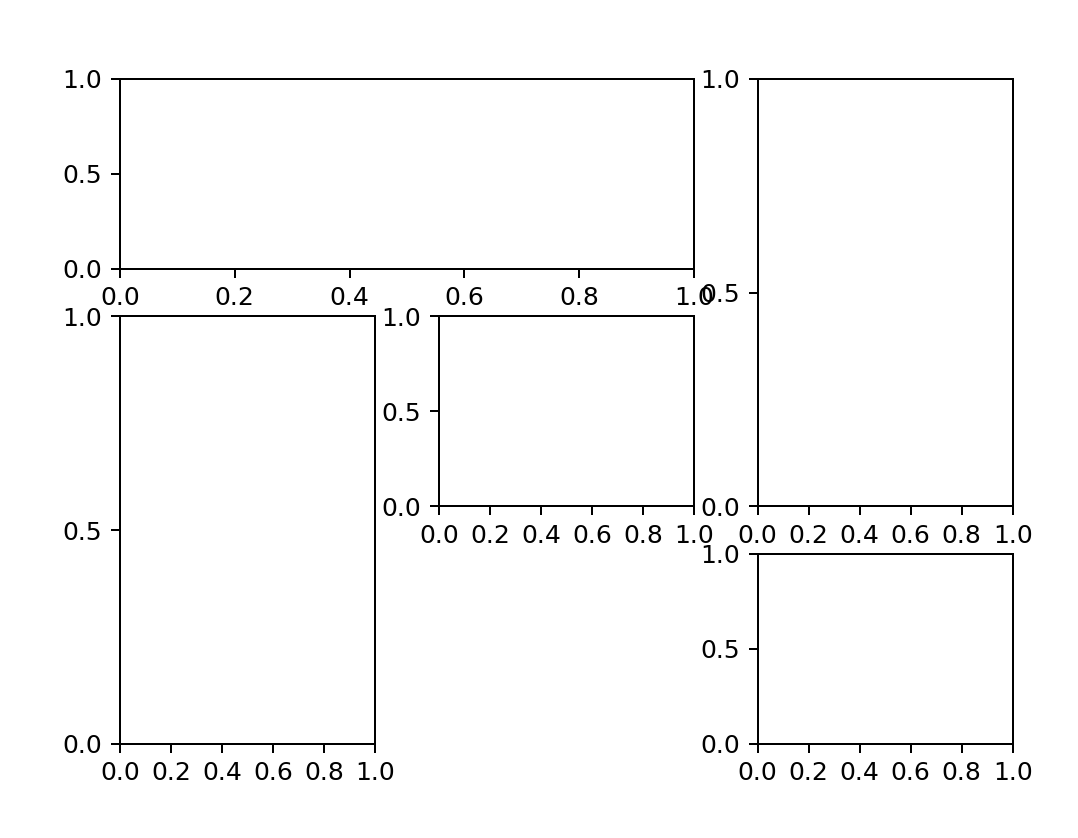
1.2 mosaic subgraph (plot. Subplot_mosaic())
this layout function is also a new layout method I found when I solved the problem that the internal graph scale is not visible when subplots() x and y axes are co scaled. The syntax is as follows:
plt.subplot_mosaic(mosaic, sharex=False, sharey=False, subplot_kw, gridspec_kw, empty_sentinel='.', **fig_kw)
most of the syntax is the same as subplots, except for the following two:
- mosaic: you can pass in list or str for visual layout. See the following example.
- empty_sentinel: used to indicate that the subgraph at this position is empty, and '.' is used by default Indicates that the subgraph at this position is empty.
for example, we want to divide the subgraph into 3 * 3, a total of 9 pieces. The first row, the first and second columns are merged, the first column, the second and third rows are merged, the third column, the first and second rows are merged, and the third row and second column are not displayed. We can use the following two methods (we set the scale and spacing of the internal subgraph by the way):
- Create an image with list as the mosaic parameter
import matplotlib.pyplot as plt
fig,axes=plt.subplot_mosaic([['A','A','B'],
                            ['C','D','B'],
                            ['C','.','E']],sharex=True,sharey=True)
for ax in plt.gcf().get_axes():
    ax.tick_params(labelbottom=True, labelleft=True)
plt.subplots_adjust(wspace = 0.25,hspace = 0.25)
- Create an image using str newline as mosaic parameter
import matplotlib.pyplot as plt
fig,axes=plt.subplot_mosaic('''AAB
                      CDB
                      C.E''',sharex=True,sharey=True)
for ax in plt.gcf().get_axes():
    ax.tick_params(labelbottom=True, labelleft=True)
plt.subplots_adjust(wspace = 0.25,hspace = 0.25)
results obtained:
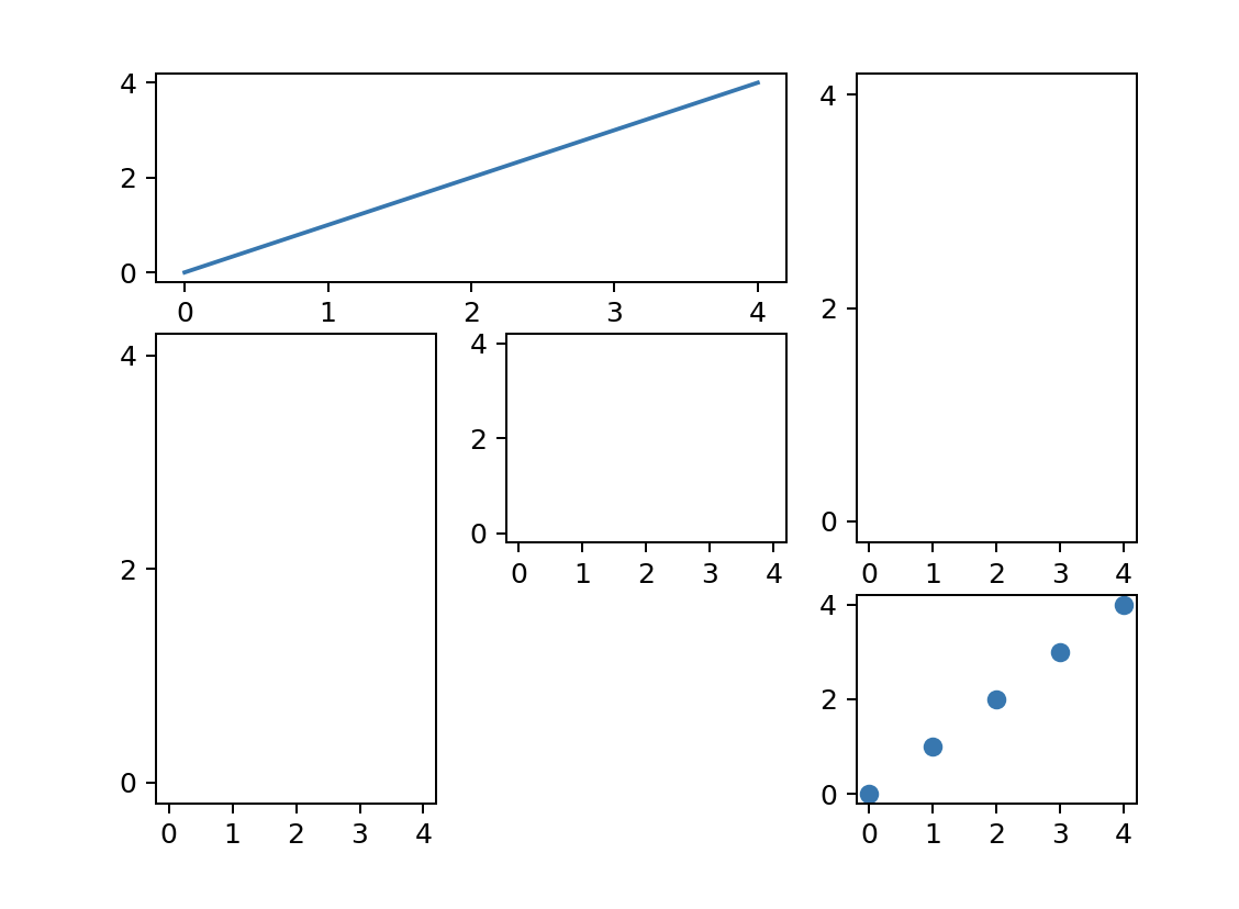
if we want to operate on some subgraphs, we just need to operate on the subgraph with the corresponding name:
axes['A'].plot(pos)
axes['E'].scatter(pos,pos)
1.3 grid division (mpl.gridspec.GridSpec())
matplotlib.gridspec.GridSpec() can divide the current Figure into grids, and then generate the desired subgraph in a way similar to array slicing. The main syntax is as follows
matplotlib.gridspec.GridSpec(nrows, ncols, figure, left, bottom, right, top, wspace, hspace, width_ratios, height_ratios)
the main parameters are as follows:
- nrows and ncols: represent the number of rows and columns respectively
- left, bottom, right, top: the range framed in the subgraph. For example, left=0.2 means that there is 20% clearance from the left boundary, left cannot be greater than right, and bottom cannot be greater than top. If not given, these values will be represented by the default parameters in Figure or rcParams.
- wspace and hspace: represent row spacing and column spacing respectively
- width_ratios and height_ratios: respectively represents the proportion of row spacing and column spacing. The parameter should be array like object or the number of rows and columns. Note: if it is a matrix like object, the dimension should be consistent with the number of rows and columns.
give the following examples:
import matplotlib.pyplot as plt
import matplotlib.gridspec as gridspec

plt.figure()
gspec = gridspec.GridSpec(3, 3,left=0.2,width_ratios=[1,4,9],height_ratios=[1,4,9])

top_subplots = plt.subplot(gspec[0, 1:])
side_subplots_1 = plt.subplot(gspec[0, 0])
side_subplots_2 = plt.subplot(gspec[1,0])
side_subplots_3 = plt.subplot(gspec[2,0])
bottom_subplots = plt.subplot(gspec[1:,1:])
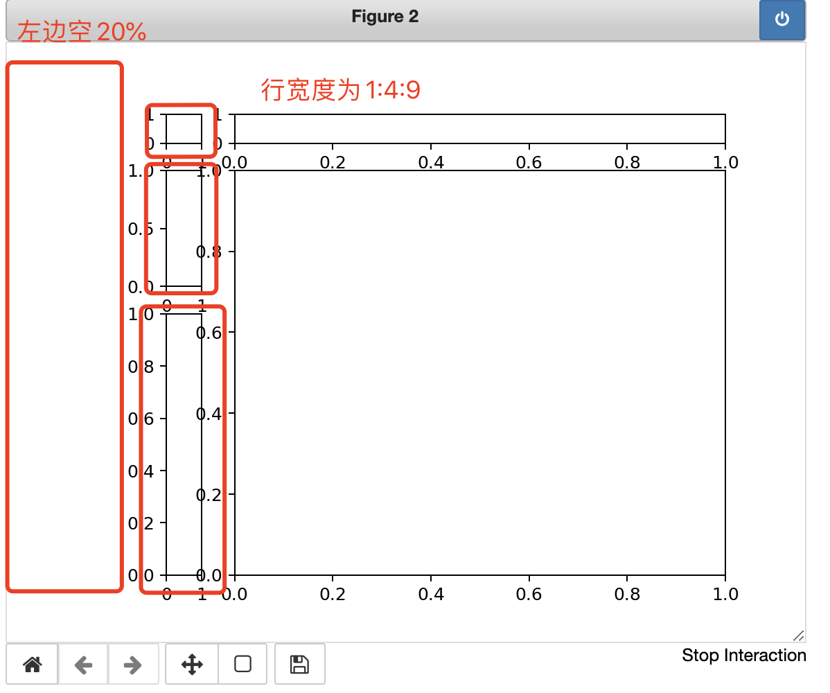
combined with the above images, we can quickly understand the meaning of each parameter.
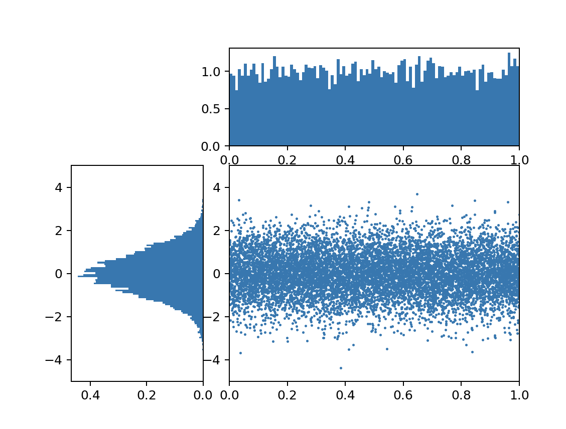
1.4 reasonable division and drawing
import matplotlib.pyplot as plt
import matplotlib.gridspec as gridspec
import numpy as np

plt.figure()
gspec = gridspec.GridSpec(3, 3)

#Divide the figure into three pieces
top_histogram = plt.subplot(gspec[0, 1:])
side_histogram = plt.subplot(gspec[1:, 0])
lower_right = plt.subplot(gspec[1:, 1:])

#Generate 10000 normally distributed data
Y = np.random.normal(loc=0.0, scale=1.0, size=10000)
#Generate 10000 randomly distributed data
X = np.random.random(size=10000)

lower_right.scatter(X, Y,s=1) #Scatter plot
top_histogram.hist(X, bins=100) #Draw X histogram
side_histogram.hist(Y, bins=100, orientation='horizontal') #Draw Y histogram

#Clear the sub graph above and draw the histogram of X data
top_histogram.clear()
top_histogram.hist(X, bins=100, density=True)

#Clear the side subgraph and draw the histogram of Y data
side_histogram.clear()
side_histogram.hist(Y, bins=100, orientation='horizontal', density=True)

#Invert the x-axis of the side histogram
side_histogram.invert_xaxis()

#Change the x and y coordinate range of each graph
for ax in [top_histogram, lower_right]:
    ax.set_xlim(0, 1)
for ax in [side_histogram, lower_right]:
    ax.set_ylim(-5, 5)
2, Basic graph and common statistical graph
2.1 drawing basis
in the previous chapter, we introduced several main examples and control methods in the Artist layer of matplotlib matplotlib functional drawing and object-oriented drawing foundation In Chapter 1.2 and 1.3 of this chapter, the two situations are summarized again (the difference between X and Y axes can only be changed by changing X and Y. here, only x is taken as an example, and y can be obtained similarly):
- Set Sketchpad: PLT Figure (figsize, dpi, facecolor), where figsize represents the size of the drawing board, dpi is the number of pixels per inch, and facecolor is the fill color
- Set title: PLT Title () or ax set_ Title () (the title can input mathematical symbols in Latex format)
- Label the x and y axes: PLT Xlabel () or ax set_ xlabel()
- Set the range of x and y axes: PLT Xlim () or ax set_ xlim()
- Label the scale values and scales of the x and y axes:
in pyplot, you can use PLT Xticks (pos, ticktabs): the first pos is to set the scale value. You can give a list. The second parameter ticktabs can be filled in optionally, indicating that the previous pos is renamed. For example, the original scale is [0,1,2]. If you want to change it to 19901991992, you can use PLT xticks([0,1,2],[1990,1991,1992]);
In OO (object oriented) drawing, you can use ax set_ Xticks() to set the scale value, and then use ax set_ Xticklabels() to set the label of the scale
example sentence:
pos=np.arange(0,5,1)
Language=['Python','SQL','Java','C++','JavaScript']
#Method 1:
plt.xticks(pos,Language)

#Method 2:
ax=fig.add_subplot(111)
ax.set_xticks(pos)
ax.set_xticklabels(Language)
- Setting drawing note: PLT The parameter loc in legend (loc) represents the placement position. You can use loc='best 'so that the system will help you select the best placement position.
- Save picture: PLT savefig()
- Display picture: PLT Show(), if% matplotlib notebook is used, an interactive image will be returned by default and can be kept updated.
- To make the border of the subgraph invisible:
You can set the spines value of the corresponding border to invisible. There are four types:
plt.gca().spines['top'].set_visible(False)
plt.gca().spines['right'].set_visible(False)
plt.gca().spines['left'].set_visible(False)
plt.gca().spines['bottom'].set_visible(False)
The language can be simplified by LC expression or iterator, for example:
for spine in plt.gca().spines.values():
    spine.set_visible(False)
#LC expression
[plt.gca().spines[loc].set_visible(False) for loc in ['top','right','bottom','left']]
- Add text:
plt.text(x,y,string,fontsize=,va="",ha="",bbox={'fc':'', 'ec':''})
As long as the values of x and y are set, the text string and font size are set, va stands for vertical alignment, i.e. vertical alignment, and ha stands for horizontal alignment, i.e. horizontal alignment. Examples will be given below
2.2 line diagram (plot. Plot)
the general line diagram can be PLT The main syntax is
plt.plot(x=,y=,ls=,lw=,c=,marker=,s=,markeredgecolor=,markerfacecolor, label=)
Main parameters:
- x. Y is the data on the x-axis and y-axis respectively
- ls: linestyle style of polyline
- lw: linewidth
- c: color the color of the polyline
- maker: style of points on polylines
- makeredgecolor: the color of the point boundary on the polyline
- makerfacecolor: the color filled in the middle of the points on the polyline
- Label: the label of broken line, which can be displayed in legend
Supplement 1: in fact, ls and maker can be used together. For example, directly giving '– o' means setting the first style as –, and setting the style of the point on the polyline as' o '
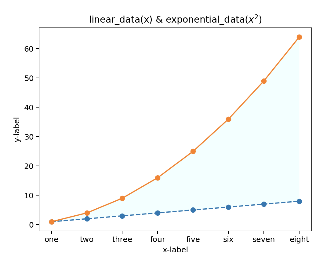
Supplement 2: fill can also be used between two line diagrams_ The syntax is as follows: axes fill_ Between (x, Y1, y2 = 0, where = none, interpolate = false, step = none, *, data = none, * * kwargs) (pyplot also has similar usage) is mainly used to determine the x-axis range, two lines, and which points in the x-axis need to be filled (where parameter) and determine the filling color.
import numpy as np
import matplotlib.pyplot as plt


linear_data = np.array([1,2,3,4,5,6,7,8])

exponential_data = linear_data**2
eng=['one','two','three','four','five','six','seven','eight']
plt.figure()
plt.plot(linear_data, '--o',exponential_data,'-o')
plt.xlabel('x-label')
plt.ylabel('y-label')
plt.title('linear_data(x) & exponential_data($x^2$)')
plt.xticks(range(8),eng)
plt.gca().fill_between(range(len(linear_data)),
                       linear_data, exponential_data,
                       facecolor='azure',
                       alpha=1)#alpha is a transparent base, between 0 and 1. The lower it is, the more transparent it is
2.3 bar chart (PLT. Bar) & PLT barh())
PLT for bar chart Bar () or PLT The former is a vertical bar chart and the latter is a horizontal bar chart. The common syntax is as follows:
plt.bar(x, height, width=0.8, bottom=None, color=,edge=, align='center')
- x: Value of x-axis
- Height: bar height
- Width: bar width
- Bottom: the bottom bar when stacking bar charts (left in plt.barh())
- Color: bar fill color
- edge: bar border color
- align: alignment on the x axis
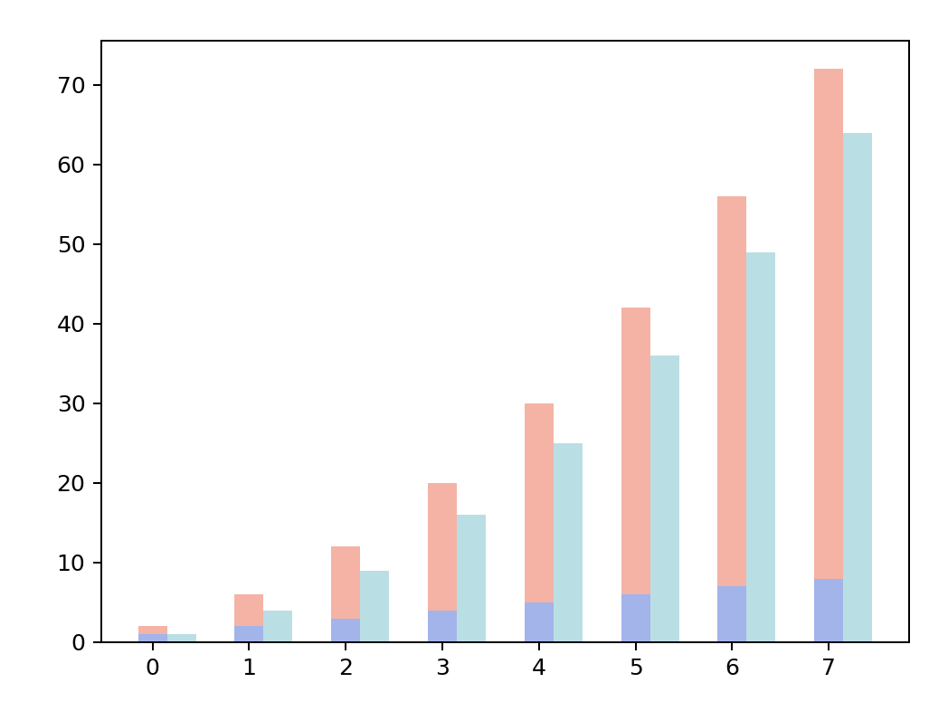
Supplement 1: if you need to draw two bar charts, you can solve it by adding the width of the bar chart to each x.
linear_data = np.array([1,2,3,4,5,6,7,8])
exponential_data = linear_data**2

plt.figure()
xvals = range(len(linear_data))
plt.bar(xvals, linear_data, width = 0.3, color='royalblue',alpha=0.5)
plt.bar(xvals, exponential_data, width = 0.3, bottom=linear_data, color='tomato',alpha=0.5)

new_xvals = []#+ 0.3 when setting a new x coordinate
for item in xvals:
    new_xvals.append(item+0.3)

plt.bar(new_xvals, exponential_data, width = 0.3 ,color='powderblue')
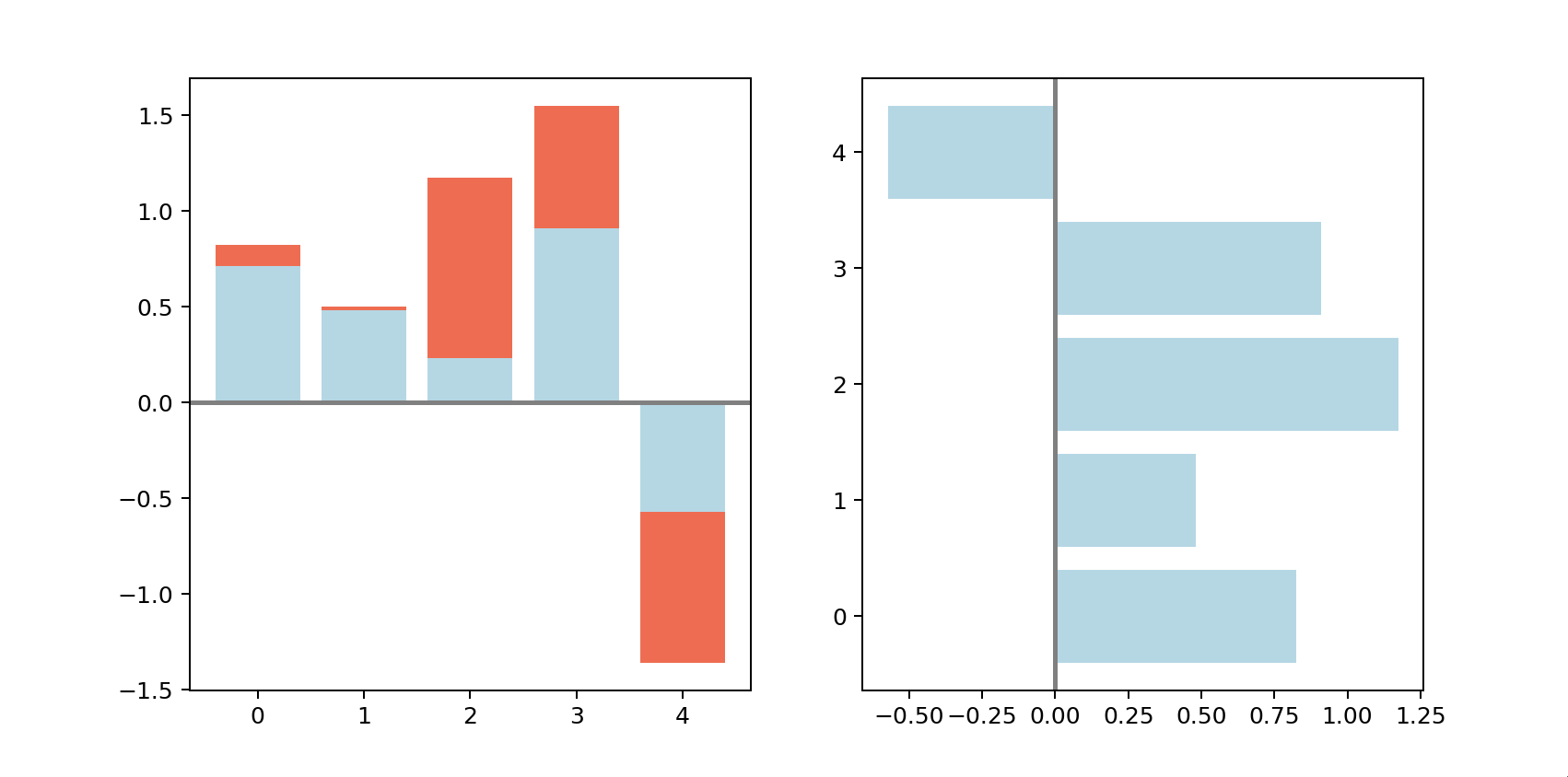
Supplement 2: if you need to draw auxiliary lines, you can use ax Axhline() draws a horizontal auxiliary line with ax Axvline() draws vertical guides
np.random.seed(666)
x = np.arange(5)
y = np.random.randn(5)
z = np.random.randn(5)

fig, axes = plt.subplots(1,2,figsize=plt.figaspect(1/2))#0.5 times the width of figure

vert_bars = axes[0].bar(x, y, color='lightblue', align='center')
vert_bars = axes[0].bar(x, z, bottom = y,color='tomato', align='center')
horiz_bars = axes[1].barh(x,y, color='lightblue', align='center')

#Draw an auxiliary line horizontally or vertically
axes[0].axhline(0, color='gray', linewidth=2)
axes[1].axvline(0, color='gray', linewidth=2)
2.4 histogram (PLT. Hist)
if we want to view the distribution of a data set, we can use histogram and PLT Hist(), whose syntax is as follows: PLT hist(x, bins=None, range=None, density=False, weights=None, cumulative=False, bottom=None, histtype='bar', align='mid', orientation='vertical', rwidth=None, log=False, color=None, label=None, stacked=False, *, data=None, **kwargs)
Main parameters:
- bins:
There are two filling methods. Fill in numbers, and mpl will help you divide the data into several boxes. You can also fill in the range of each box. Pay attention to taking the data before and after the division. For example, if you write [1,2,3,4], it will be divided into four boxes, namely [1,2], [2,3], [3,4], ['represents that you can get it and' ('represents that you can't get it. - Range: upper and lower bounds. Data beyond the range will not be retrieved
- Density: take True to return the density curve
- weights: weight, which is passed in the same weight array as the x shape. The default is 1
- Cumulative: calculate cumulative frequency
- bottom: add baseline
- align: alignment form
- Color: fill color
- label: label
Supplement 1: how to determine the number of boxes? In the paper selecting the number of bins in a histogram: a decision theoretical approach by Kun He and Glen Meeden, it is obtained that when the number of data pieces is n n When n, the number of boxes can be taken ( 2 n ) 1 / 3 (2n)^{1/3} (2n)1/3.
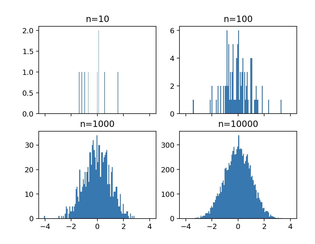
import numpy as np
import matplotlib.pyplot as plt

fig, axs = plt.subplots(2, 2, sharex=True)

for n in range(0,4):
    sample_size = 10**(n+1)
    sample = np.random.normal(loc=0.0, scale=1.0, size=sample_size)
    axs[int(n/2),n%2].hist(sample,bins=100)
    axs[int(n/2),n%2].set_title('n={}'.format(sample_size))
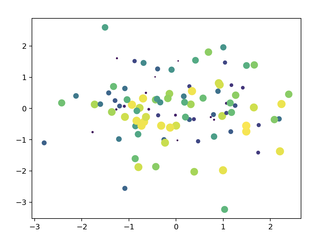
2.5 scatter plot (PLT. Scatter)
the scatter diagram can use PLT Scatter (), just give the data of X axis and Y axis.
Supplement 1: the scatter diagram can use another data Z to reflect the size. Set the parameter s=Z, for example:
import numpy as np
import matplotlib.pyplot as plt

np.random.seed(123)
x=np.random.randn(100)
y=np.random.randn(100)
z=np.random.randint(1,100,100)

plt.figure()
plt.scatter(x,y,s=z,c=z)
2.6 box diagram (plt.boxplot())
box plot, also known as Whistler plot, can take quartile, mean value, maximum and minimum value for drawing, which can be drawn with plot boxplot().
import pandas as pd
import matplotlib.pyplot as plt

normal_sample = np.random.normal(loc=0.0, scale=1.0, size=10000)
random_sample = np.random.random(size=10000)
gamma_sample = np.random.gamma(2, size=10000)

df = pd.DataFrame({'normal': normal_sample,
                   'random': random_sample,
                   'gamma': gamma_sample})

plt.figure()
plt.boxplot([ df['normal'], df['random'], df['gamma'] ])
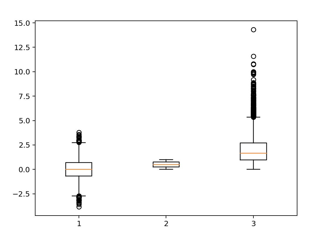
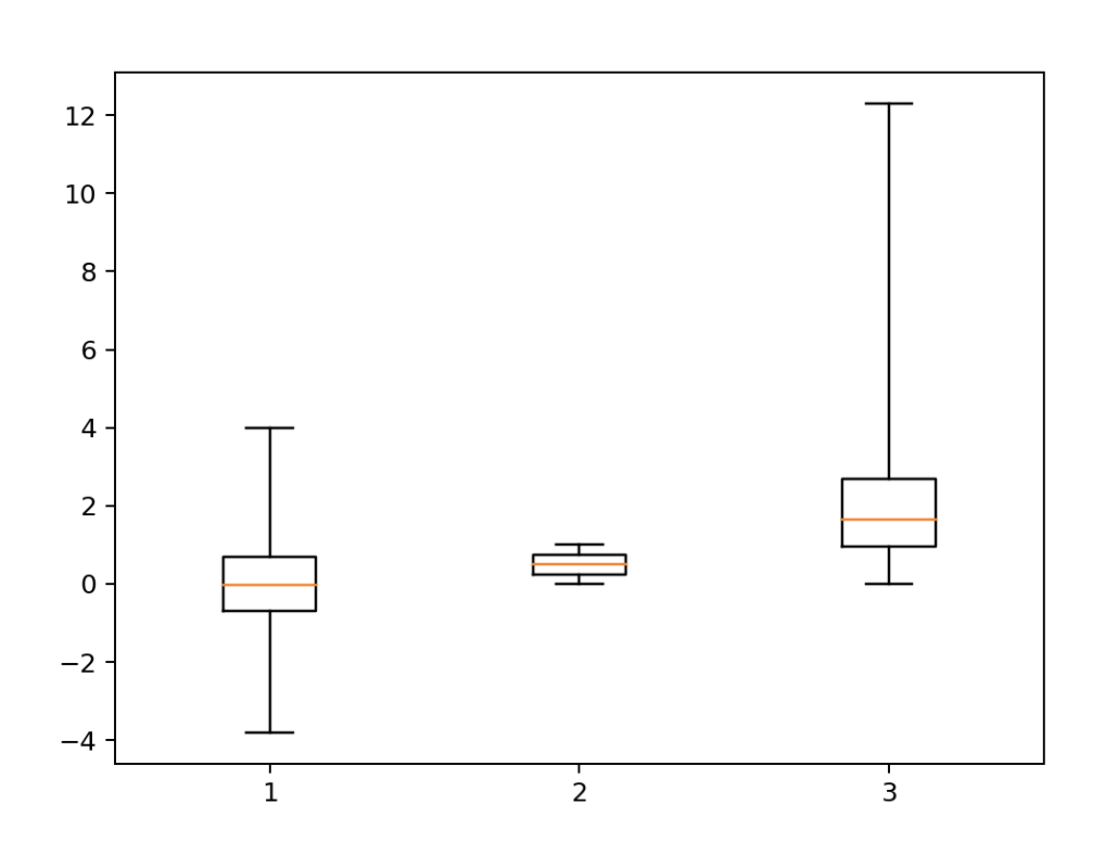
Supplement 1: common box diagram will have tail, that is, exclude some data and do not get it. If you want to bring all data in, you can set why = (0100)
plt.figure()
plt.boxplot([ df['normal'], df['random'], df['gamma'] ],whis=(0,100))
summary
- The first chapter mainly introduces three methods of drawing board layout, PLT subplots(),plt.subplot_mosaic() and MPL gridspec. GridSpec()
- The first section of the second chapter introduces how to set each instance of the subgraph
- The second chapter introduces the commonly used graphics
- Next, we will introduce how to use plt to realize animation and interaction