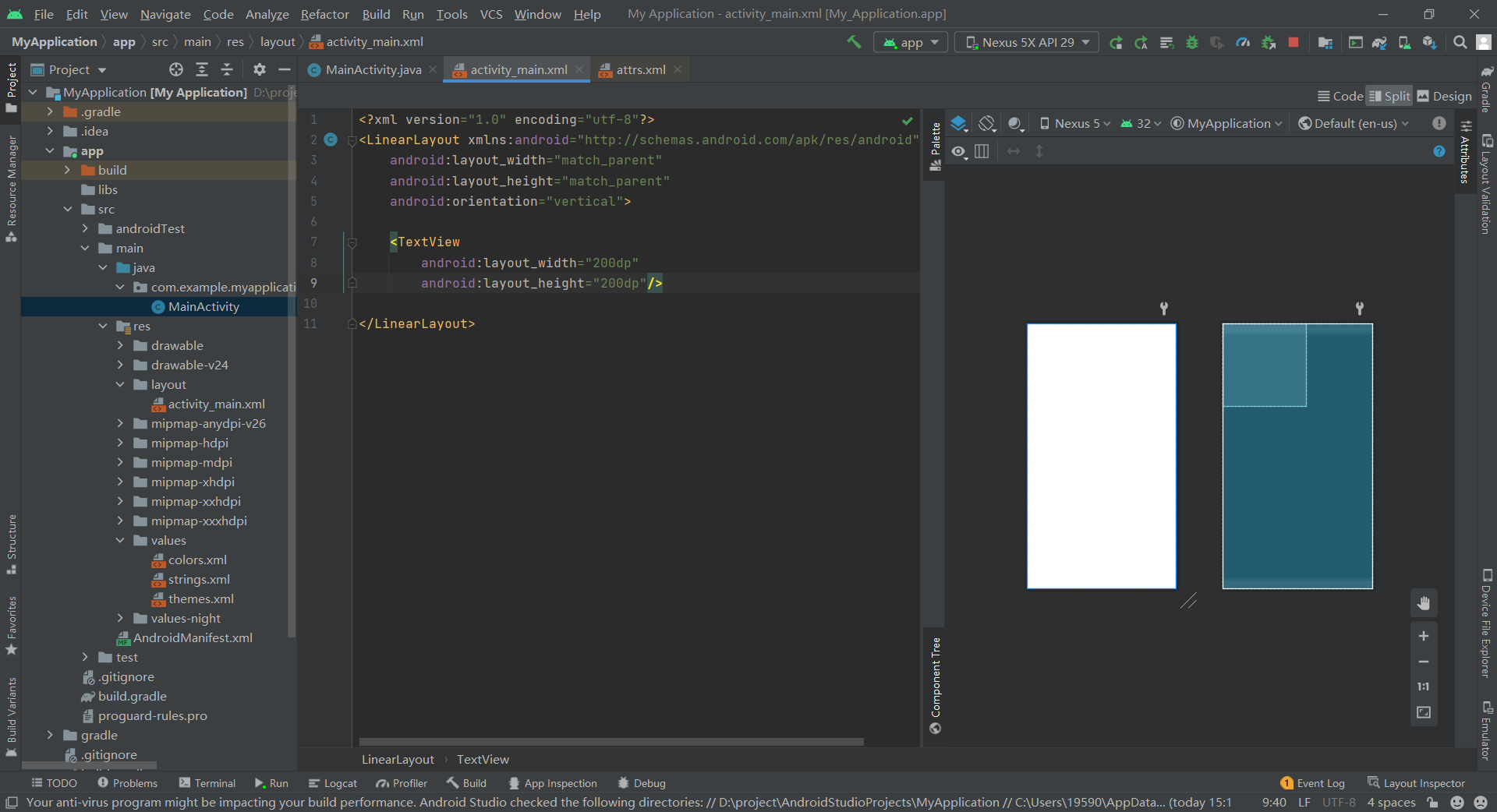
Basic framework
The following codes are in activity_main.xml.
<LinearLayout xmlns:android="http://schemas.android.com/apk/res/android"
    android:layout_width="match_parent"
    android:layout_height="match_parent"
    android:orientation="vertical">

    <TextView
        android:layout_width="200dp"
        android:layout_height="200dp"/>

</LinearLayout>
Basic properties
width and height
The statement controlling the width is layout_width = "", the height control statement is layout_height="".
Match can be filled in the colon_ Parent, indicating that the width of the control follows the width of the container (LinearLayout); You can also fill in wrap_content, indicating that it is automatically allocated according to the control, but it cannot exceed the container size. In addition to these two, you can also directly fill in the specific size, such as 200dp.
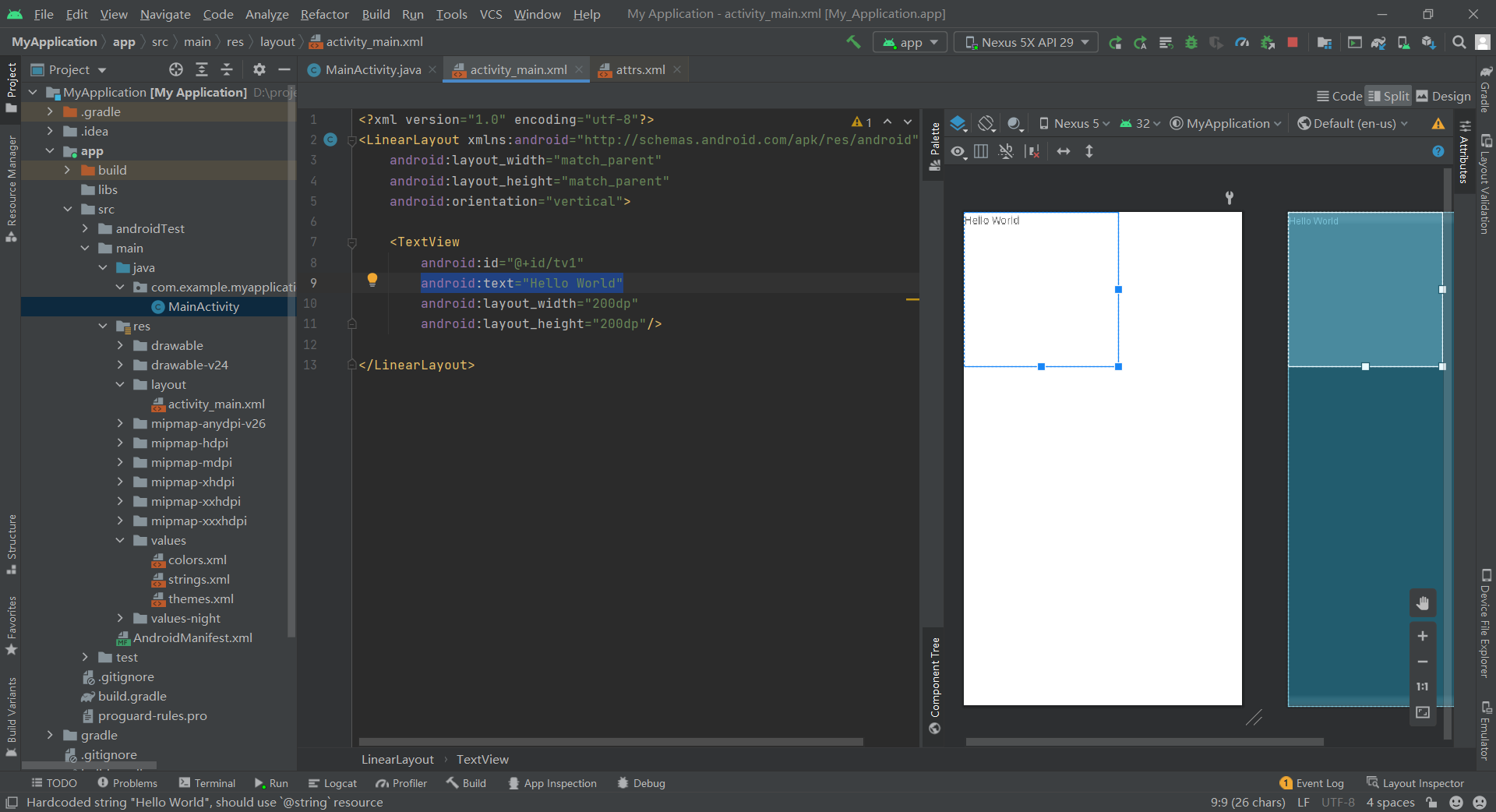
id
ID is the name of the space so that it can be invoked in Java code. The format is android:id="@+id/tv1", where tv1 is the name of the TextView.
After adding the above code, we can find the control corresponding to an id through the function in the Java code and turn it into an object for other operations, as shown below:
TextView tv1=findViewById(R.id.tv1);
tv1.setText("ShadyPi");
text
Set the displayed text content in the format of text = "" and text in quotation marks. When I add the code android:text="Hello World", I can see the corresponding text in the preview.
The function of setText in the Java code in the previous section is to set the content of text. Therefore, when this code actually runs, the initial Hello World will be overwritten by ShadyPi in Java code.
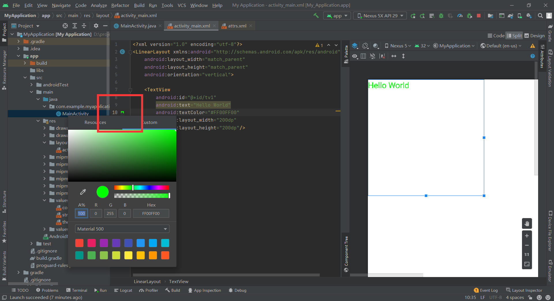
textColor
Good understanding. Set the font color. However, it should be noted that the format is set with textColor="#00000000", and the number in quotation marks has 8 digits.
The first two digits indicate transparency, 00 is fully transparent and FF is fully opaque.
The last six bits represent red, green and blue in turn, that is, a 256 bit RGB color palette. At the same time, you can also click the small color block in the code bar on the left to color directly:
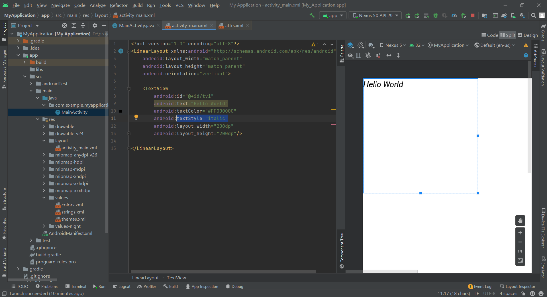
textStyle
There are three font styles: normal, bold and italic, which are no effect, bold and italic respectively.
If you use textStyle="italic", the font will become oblique.
textSize
The font size is generally sp, and the display size will vary according to the user's screen size.
If it is set to android:textSize="40sp", the display effect is:

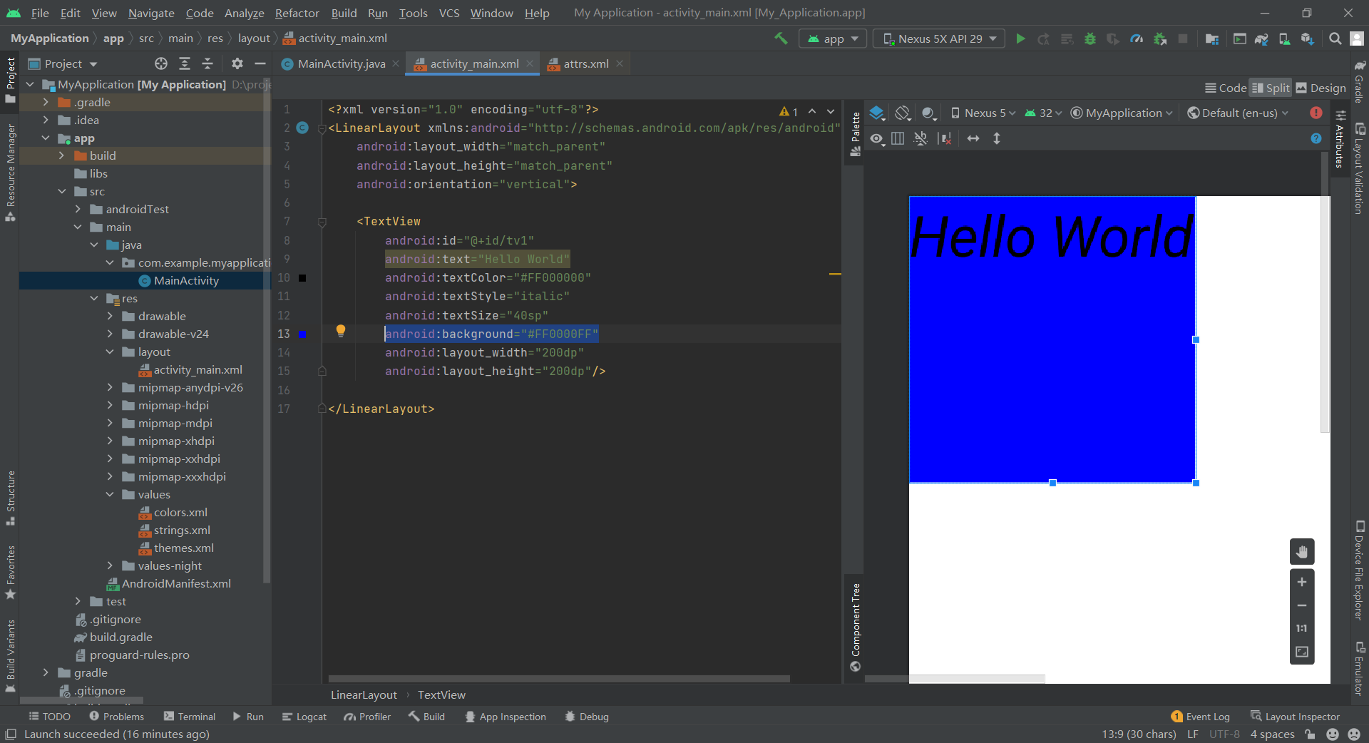
background
Set the background of the control, which can be solid color or picture. If filled with solid color, the color adjustment is the same as textColor, which will not be described in detail.
Take android:background="#FF0000FF" as an example, the effect is:
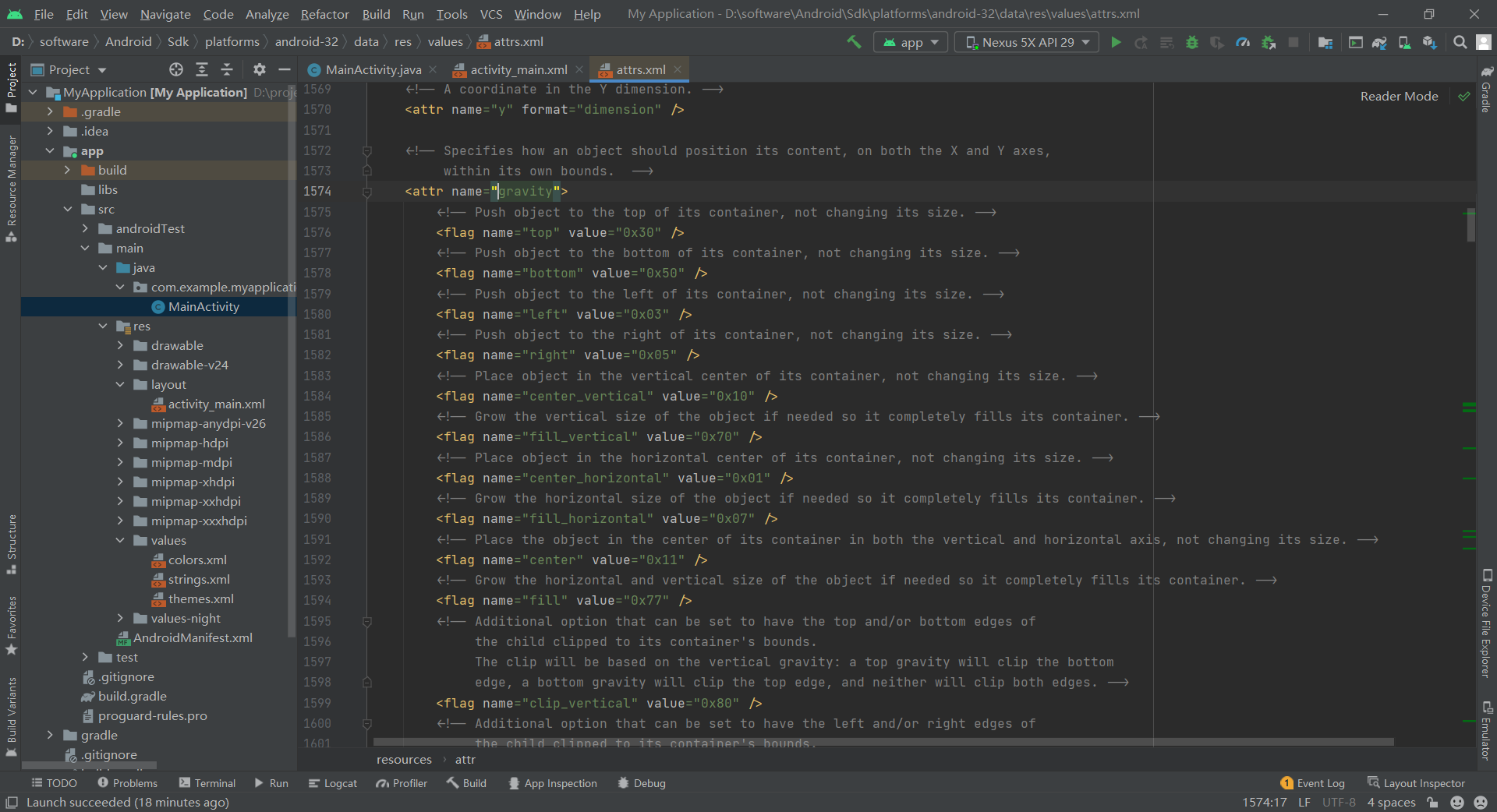
gravity
Gravity is the direct translation of gravity, which is actually the alignment direction. There are center,bottom,left, etc. if you can't remember, you can press and hold Ctrl and left click gravity to view:
After setting android:gravity="bottom", the effect is as follows:

be careful
It should be noted that in formal development, in theory, the text and color resources used by the control should not be directly in the activity_main.xml, but should be set in res - > values.
For example, strings Add a string in the XML file with the name of author and the content of ShadyPi, i.e
<resources>
    <string name="app_name">My Application</string>
    <string name="author">ShadyPi</string>
</resources>
When you want to call, in the activity_ main. You can call it by entering @ string / String name in XML. For example, the effect is to change the code to android:text="@string/author"

At the same time, in activity_ main. You can also jump to strings.xml by Ctrl + left clicking @ string/author XML to see what the string corresponding to the name is.
The same color, using @color/ color name can be called from the default color, such as android:textColor="@color/black", custom color process is the same string.
shadow
shadowColor
Set the shadow color, but it needs to be used with shadowRadius. It is invalid to use it alone.
shadowRadius
Set the shadow blur level, 0.1 will become clearer, similar to the font, and 3.0 will be more blurred and more like shadow.
shadowDx and shadowDy
Set the offset of the shadow in the horizontal and vertical directions, that is, the abscissa and ordinate position of the shadow start.
Add the following code in TextView:
android:shadowColor="@color/teal_200"
android:shadowRadius="0.1"
android:shadowDx="10"
android:shadowDy="10"
You can see the following effects:

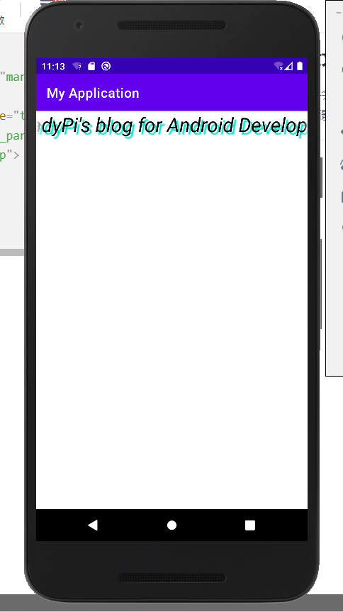
Scroll text
singleLine
Make text appear in a single line
focusable
Can I get focus
focusableInTouchMode
Used to control whether the view can be focused in touch mode
ellipsize
Where to omit text
marqueeRepeatLimit
The number of times the subtitle animation is repeated
Set these as follows:
android:singleLine="true"
android:ellipsize="marquee"
android:marqueeRepeatLimit="marquee_forever"
android:focusable="true"
android:focusableInTouchMode="true"
However, after running the app, it is found that the text needs to be clicked before the text can start scrolling, because scrolling can only be triggered after obtaining the focus. To make the text scroll spontaneously, you need to make the text automatically get the focus. There are two ways.
One is to customize a text class to obtain the focus by ourselves. We can create a new Java file and declare a subclass ScrollingText of TextView. After declaration, click ScrollingText to let AS automatically help complete the three builders. What we need to do is to define an isFocused() function to enable him to obtain the focus all the time. The code is AS follows:
package com.example.myapplication;

import android.content.Context;
import android.util.AttributeSet;
import android.widget.TextView;

import androidx.annotation.Nullable;

public class ScrollingText extends TextView {
    public ScrollingText(Context context) {
        super(context);
    }

    public ScrollingText(Context context, @Nullable AttributeSet attrs) {
        super(context, attrs);
    }

    public ScrollingText(Context context, @Nullable AttributeSet attrs, int defStyleAttr) {
        super(context, attrs, defStyleAttr);
    }

    @Override
    public boolean isFocused() {
        return true;
    }
}
After defining this new class, we can_ main. XML, change the TextView class to the ScrollingText class. After running this way, the text can scroll automatically.
<?xml version="1.0" encoding="utf-8"?>
<LinearLayout xmlns:android="http://schemas.android.com/apk/res/android"
    android:layout_width="match_parent"
    android:layout_height="match_parent"
    android:orientation="vertical">

    <com.example.myapplication.ScrollingText
        android:id="@+id/tv1"
        android:text="@string/author"
        android:textColor="@color/black"
        android:textStyle="italic"
        android:textSize="30sp"
        android:shadowColor="@color/teal_200"
        android:shadowRadius="3.0"
        android:shadowDx="10"
        android:shadowDy="10"
        android:gravity="center_horizontal"
        android:clickable="true"
        android:singleLine="true"
        android:ellipsize="marquee"
        android:marqueeRepeatLimit="marquee_forever"
        android:focusable="true"
        android:focusableInTouchMode="true"
        android:layout_width="match_parent"
        android:layout_height="200dp"/>

</LinearLayout>
In addition to inheritance, there is a simpler method. After declaring TextView, add a line < requestfocus / >, as follows:
<?xml version="1.0" encoding="utf-8"?>
<LinearLayout xmlns:android="http://schemas.android.com/apk/res/android"
    android:layout_width="match_parent"
    android:layout_height="match_parent"
    android:orientation="vertical">

    <TextView
        android:id="@+id/tv1"
        android:text="@string/author"
        android:textColor="@color/black"
        android:textStyle="italic"
        android:textSize="30sp"
        android:shadowColor="@color/teal_200"
        android:shadowRadius="3.0"
        android:shadowDx="10"
        android:shadowDy="10"
        android:gravity="center_horizontal"
        android:clickable="true"
        android:singleLine="true"
        android:ellipsize="marquee"
        android:marqueeRepeatLimit="marquee_forever"
        android:focusable="true"
        android:focusableInTouchMode="true"
        android:layout_width="match_parent"
        android:layout_height="200dp">
        <requestFocus/>
    </TextView>

</LinearLayout>
The same effect can be achieved.