catalogue
Stacked / horizontal bar chart: (two variables, two dimensions)
Add scale values to the pie chart:
Simple histogram: just one code
Specifies a histogram for the number of groups and colors
Add histogram of whisker chart:
Add histogram of normal density curve and outline:
The simplest nuclear density diagram:
Higher level nuclear density map:
Comparable nuclear density maps:
Single grouping factor box diagram ---- > one independent variable: cyl
Box diagram of two cross factors ---- > two independent variables: cyl, am
Point graph after grouping, sorting and coloring
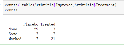
Import the vcd package, but don't use it to draw pictures for the time being. We just need the artis dataset in the vcd package
Simple bar chart
The bar chart shows the distribution (frequency) of category variables through vertical or horizontal bars. The simplest use of the function barplot() is:
barplot (height), where height is a vector or a matrix.
vector
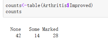
Load the data we want to use. In the arthritis study, the variable Improved records the treatment results of each patient who received placebo or drug treatment:
library(vcd)
counts<-table(Arthritis$Improved)
counts
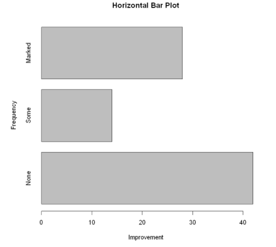
Use the option horiz=TRUE to generate a horizontal bar chart. The option main can add a graphic title, while the options xlab and ylab will add x-axis and y-axis labels respectively.
barplot(counts,
        main="Simple Bar Plot",
        xlab="Improvement",
        ylab="Frequency")
#level
barplot(counts,
        main="Horizontal Bar Plot",
        xlab="Improvement",
        ylab="Frequency",
        horiz=TRUE)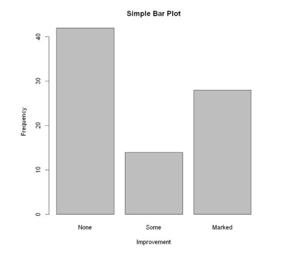
If the category variable to be plotted is a factor or an ordered factor, you can quickly create a vertical bar chart using the function plot(). Since arthritis $improved is a factor, the code does not need to tabulate it using the table() function.
matrix
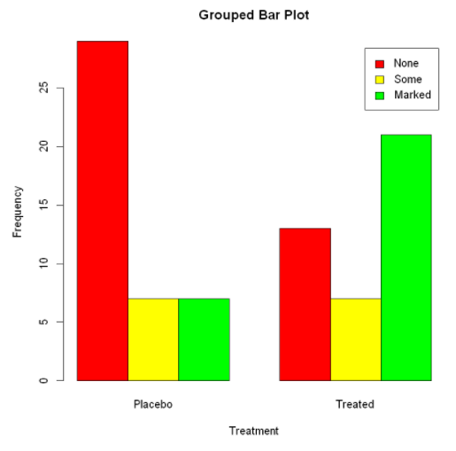
If height is a matrix, the drawing result will be a stacked bar chart or grouped bar chart. If beside=FALSE (default), each column in the matrix will generate a bar in the chart, and the value in each column will give the height of the stacked "sub bars". If beside=TRUE, each column in the matrix represents a grouping, and the values in each column will be juxtaposed rather than stacked.
Load data:
counts<-table(Arthritis$Improved,Arthritis$Treatment)
counts
Stacked / horizontal bar chart: (two variables, two dimensions)
barplot(counts,
        main="Stacked Bar Plot",  #main="Grouped Bar Plot"
        xlab="Treatment",
        ylab="Frequency",
        col=c("red","yellow","green"),
        legend=rownames(counts),
#(horizontal sides = true)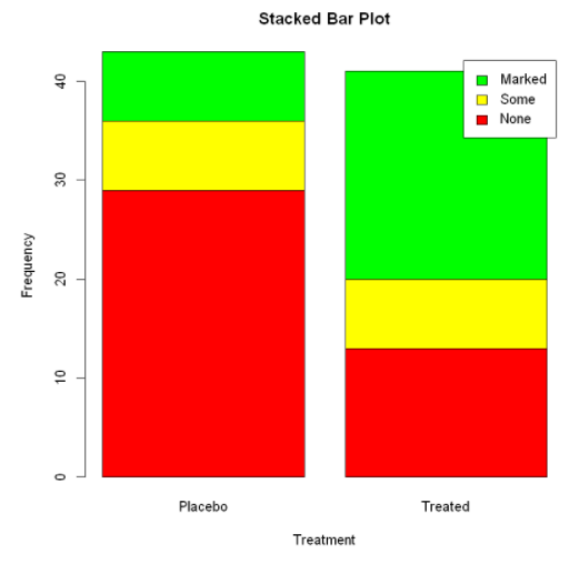
Mean bar graph
The bar graph does not have to be based on count data or frequency data. You can use the data integration function and pass the results to the barplot () function to create a bar graph representing the mean, median, standard deviation, etc.
Calculated mean:
aggregate() summary function, state$Illiteracy is grouped by according to the variable of illiteracy rate, state.region is grouped by region, and FUN=mean is calculated by the summary function
#The data frame is created by the function data.frame()
states <- data.frame(state.region,state.x77)
means <- aggregate(states$Illiteracy, by=list(state.region), FUN=mean)
means
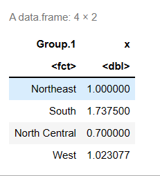
Sort the mean from small to large:
means <- means[order(means$x),]   # #Sort row label objects x
means
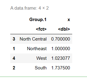
Bar chart of sorted mean:
The first parameter, mean$x, is the object to draw the graph, and the second parameter, names.arg, is the vector of names drawn under each bar or bar group. If this parameter is omitted, it indicates that this is a vector, and the name will be extracted from the name attribute of height. If it is a matrix, it will be extracted from the column name.
barplot(means$x,names.arg=means$Group.1)
title("Mean Illiteracy Rate")   #Add title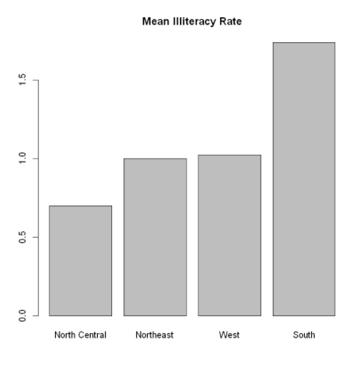
means$x is the vector containing the height of each bar, and the option names. Arg = means $group. 1 is added to show the label.
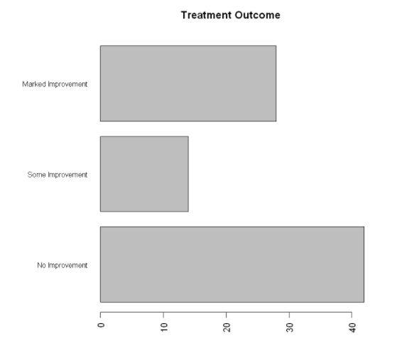
Fine tuning of bar chart
There are several ways to fine tune the appearance of the bar chart. For example, as the number of bars increases, the labels of bars may begin to overlap. You can use the parameter CEX. Names to reduce the font size. Specify a value less than 1 to reduce the size of the label. The optional parameter names. Arg allows you to specify a character vector as the label name of the bar. You can also use graphic parameters to adjust text spacing.
The par() function allows you to make a lot of changes to the default graph of R
par(mar=c(5,8,4,2))  #Increase the size of the y boundary
par(las=2)   #Rotate label to horizontal
counts<-table(Arthritis$Improved)
barplot(counts,
        main="Treatment Outcome",
        horiz=TRUE,
        cex.names=0.8,  #Reduce font size
        names.arg=c("No Improvement","Some Improvement","Marked Improvement"))  #Modify label text
Pie chart
Pie charts can be created by the following functions: pie(x,labels)
Where x is a non negative numerical vector representing the area of each sector, and labels is a character vector representing the labels of each sector.
#par(mfrow=c(2,2))   #Merge the four figures into one box
slices <- c(10,12,4,16,8)  #Area of each sector
lbls <- c("US","UK","Australia","Germany","France")
pie(slices,
    labels=lbls,
    main="Simple Pie Chart")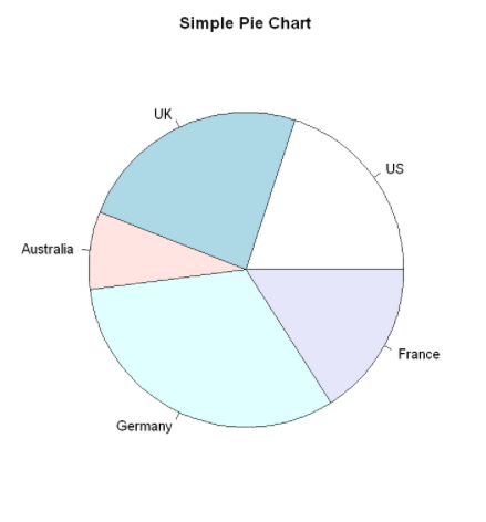
Add scale values to the pie chart:
The number of samples is converted to a proportional value and this information is added to the label of each sector. The rainbow() function is used to define the color of each sector. Here, the rainbow(length(lbls2)) will be resolved to rainbow(5), which provides five colors for the graphics.
paste: connection string function. The first parameter lbls is the connected object, the second parameter is the space, the third parameter is the percentage, the fourth parameter is the connection symbol%, and the fifth parameter is the separator sep
pct <- round(slices/sum(slices)*100)
lbls2 <- paste(lbls," ", pct,"%",sep="")
pie(slices,
    labels=lbls2,
    col=rainbow(length(lbls2)),
    main="Pie Chart with Percentages")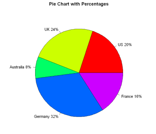
3D pie chart:
A three-dimensional pie chart created using the pie3D() function in the plotrix package
library(plotrix)
pie3D(slices,
      labels=lbls,
      explode=0.1,
      main="3D Pie Chart")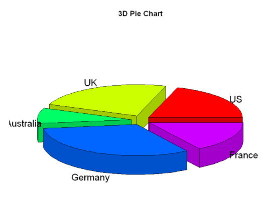
Create pie chart from table
mytable <- table(state.region)
lbls3 <- paste(names(mytable),
               "\n",
               mytable,
               sep="")
pie(mytable,
    labels=lbls3,
    main="Pie chart from a Table\n(with sample sizes)")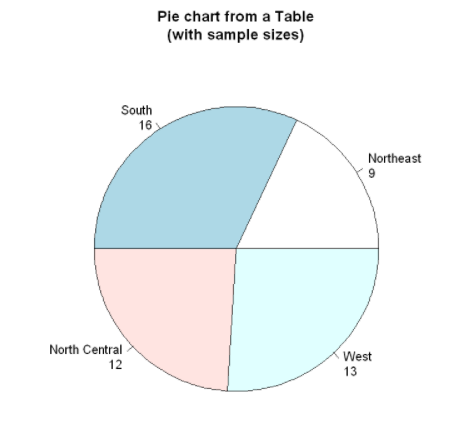
However, pie charts make it difficult to compare the values of each sector (unless these values are attached to the label). Therefore, we have created a pie variant called fan plot. Fan plot provides a way to show relative quantities and differences at the same time.
Sector diagram
In R, the pie chart is implemented through the fan.plot() function in the plotrix package
slices <- c(10,12,4,16,8)
lbls <- c("US","UK","Australia","Germany","France")
fan.plot(slices,
         labels=lbls,
         main="Fan Plot")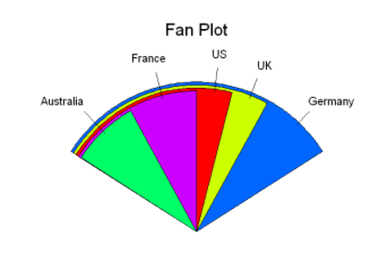
histogram
The histogram shows the distribution of continuous variables by dividing the value range into a certain number of groups on the X axis and displaying the frequency of corresponding values on the y axis. The histogram can be created by using the following function: hist (x)
Where x is a numerical vector composed of data values. The parameter freq=FALSE indicates that the graph is drawn according to probability density rather than frequency. The parameter breaks is used to control the number of groups. When defining cells in the histogram, equidistant segmentation will be generated by default.
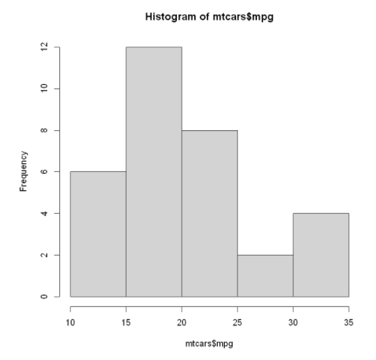
Simple histogram: just one code
hist (mtcars$mpg) #mtcars data set is selected
Specifies a histogram for the number of groups and colors
hist (mtcars$mpg,
      breaks=12,
      col="pink",
      xlab="Miles Per Gallon",
      main="Colored histogram with 12 bins")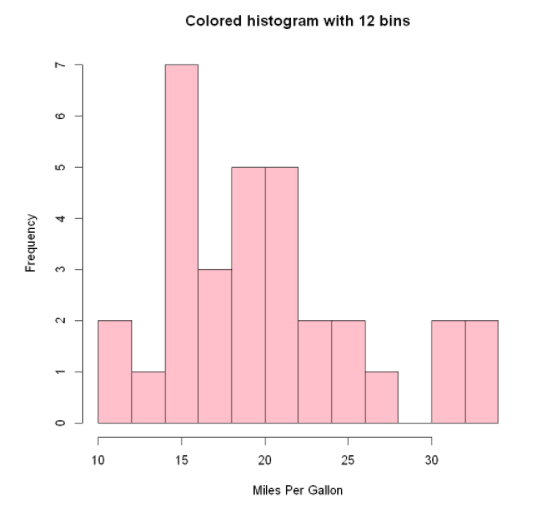
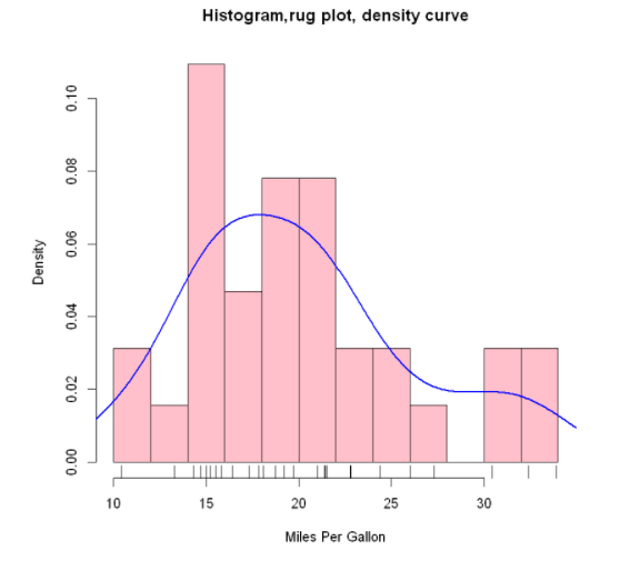
Add histogram of whisker chart:
We still retain the color, group number, label and title settings in the previous figure, and superimpose a density curve and a rug plot. This density curve is a kernel density estimation, which provides a smoother description of the data distribution. We use 1 ines () The function superimposes this blue curve that doubles the default line width. Finally, the whisker chart is a one-dimensional representation of the actual data value. If there are many knots in the data, you can use the following code to break up the data of the whisker chart:
rug (jitter (mtcars$mpag,amount=0.01) )
This adds a small random value (one) to each data point The amount is evenly distributed (random number) to avoid the influence of overlapping points.
hist (mtcars$mpg,
      freq=FALSE,
      breaks=12,
      col="pink",
      xlab="Miles Per Gallon",
      main="Histogram,rug plot, density curve")
rug(jitter(mtcars$mpg))      #There are black short lines at the bottom of the shaft whisker diagram
lines(density(mtcars$mpg),   #Density curve
      col="blue",
      lwd=2)
lwd: line width, lty=1: set as solid line, lty=2: set as dotted line
Add histogram of normal density curve and outline:
x <- mtcars$mpg
h <- hist(x,
          breaks=12,
          col="pink",
          xlab="Miles Per Gallon",
          main="Histogram with normal curve and box")
xfit <- seq(min(x), max(x), length=40)
yfit <- dnorm(xfit, mean=mean(x), sd=sd(x))
yfit <- yfit*diff(h$mids[1:2])*length(x)
lines(xfit,yfit,col="blue",lwd=2)  # lwd: line width
box()   #Generate a box that encloses the drawing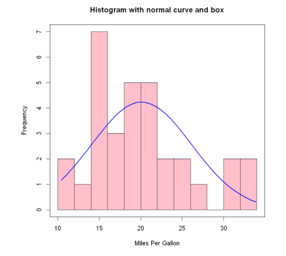
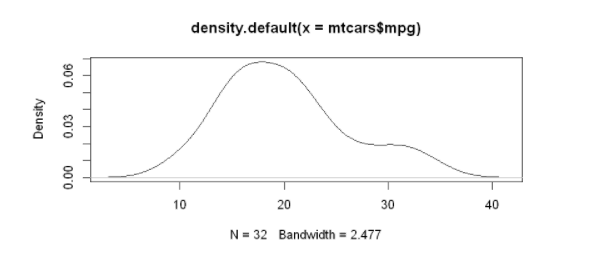
Nuclear density map
Kernel density estimation is a nonparametric method for estimating the probability density function of random variables. Generally speaking, kernel density map is an effective method for observing the distribution of continuous variables. The method of drawing density map (not superimposed on another map) is as follows:
plot (density(x))
Where x is a numeric vector. Since the plot() function creates a new graph, you can use the lines() function to superimpose a density curve on an existing graph
The simplest nuclear density diagram:
d <- density(mtcars$mpg)
plot(d)
Higher level nuclear density map:
The polygon() function draws polygons based on the x and y coordinates of the vertices (provided by the density() function in this case).
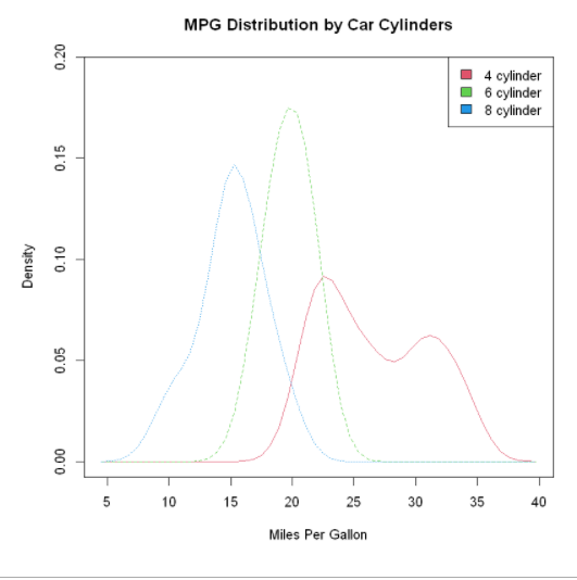
The nuclear density map can be used to compare the differences between groups. It may be due to the general lack of convenient and easy-to-use software. In fact, this method is completely useless
Have been fully utilized. Fortunately, the sm bag beautifully fills this gap. Use the sm.density.compare() function in the sm package to overlay two or more sets of kernel density maps to the graph. The format used is:
sm.density.compare(x, factor)
Where x is a numeric vector and factor is a grouped variable. Please install the sm package before using it for the first time. The example in the code compares miles per gallon of gasoline for models with 4, 6, or 8 cylinders.
plot(d,
     main="Kernel Density of Miles Per Gallon")
polygon(d,
        col="yellow",  #The curve is set to red and filled with yellow
        border="red")
rug(mtcars$mpg,    #Add black whisker diagram
    col="black")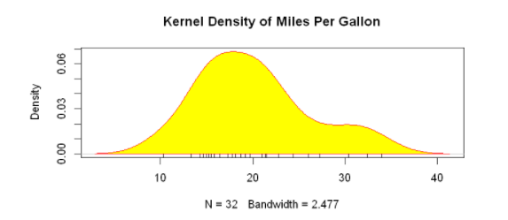
Comparable nuclear density maps:
First, load the sm package and bind the data frame mtcars. In the data frame mtcars, the variable cy1 is a numeric variable encoded with 4, 6, or 8. In order to provide the label of the value to the graph, cy1 is converted to a factor named cy1.f. The title() statement adds a title, which is equivalent to main in plot. Here, the colfill value is c(2,3,4), Then add a legend through the legend() function. The first parameter value locator (1) means to interactively place the legend by clicking on the position where you want the legend to appear. The second parameter value is the character vector composed of labels. The third parameter value specifies a color for each level of cyl.f using the vector colfill.
The superposition of nuclear density maps is a powerful method for cross group comparative observation on a certain result variable. You can see the distribution shape of the values contained in different groups and the degree of overlap between different groups.
#Load data
library(sm)
attach(mtcars)
#Create grouping factor
cyl.f <- factor(cyl,
                levels=c(4,6,8),
                labels = c("4 cylinder","6 cylinder","8 cylinder"))
# Draw nuclear density map
sm.density.compare(mpg,
                   cyl,
                   xlab="Miles Per Gallon")
title(main="MPG Distribution by Car Cylinders")
#Add legend with mouse click
colfill <- c(2:(1+length(levels(cyl.f))))
legend('topright',levels(cyl.f),fill=colfill)   # topright can also be replaced by locator(1) to add a legend to the position where the mouse clicks

detach(mtcars)
locator(1) # Click on the figure to display the legend
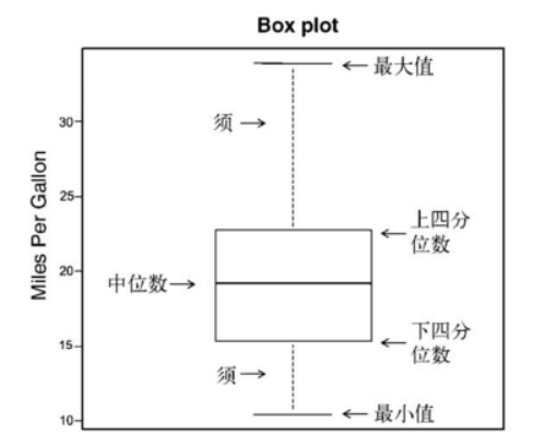
Box diagram
Box chart (also known as box and whisker chart) draws a summary of five numbers of continuous variables, namely, the minimum value, the lower quartile (25th percentile), the median (50th percentile), the upper quartile (75th percentile) and the maximum value. The distribution of continuous variables is described. The box plot can show observations that may be outliers (values outside the range + 1.5*IQR, IQR represents the interquartile distance, that is, the difference between the upper quartile and the lower quartile). Function representation:
boxplot (mtcars$mpg,main="Box plot", ylab="Miles per Gallon")
To illustrate the various components, dimensions were added manually
Single grouping factor box diagram ---- > one independent variable: cyl
The box diagram can show individual variables or grouped variables. The format used is: boxplot (formula, data = dataframe)
Among them, formula is a formula, and dataframe represents the data frame (or list) that provides data.
The example formula is y ~A, and the box diagram of numerical variable y will be generated in parallel for each value of category variable a.
Formula y ~ A*B will generate a box diagram of numerical variable y for the pairwise combination of all levels of category variables A and B.
The parameter horizontal=TRUE reverses the direction of the coordinate axis. In the following code, we used the parallel box diagram to re study the impact of four cylinder, six cylinder and eight cylinder engines on miles per gallon.
boxplot(mpg ~ cyl,
        data=mtcars,
        main="Car Mileage Data",
        xlab="Number of Cylinders0",
        ylab="Miles Per Gallon")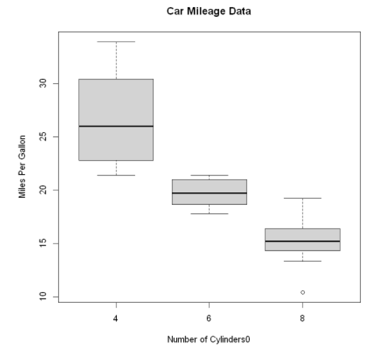
It can be seen in the figure that the fuel consumption difference between different groups is very obvious. At the same time, it can also be found that the miles per gallon of six cylinder models are more evenly distributed than the other two types of models, the miles per gallon of four cylinder models are the most widely distributed (and positive deviation), and there is an outlier in the eight cylinder group.
By adding notch=TRUE, you can get the box diagram with grooves. If the grooves of the two boxes do not overlap each other, there is a significant difference in their median. Adding the parameter varwidth=TRUE will make the width of the box graph proportional to the square root of its sample size.
boxplot(mpg ~ cyl,
        data=mtcars,
        notch=TRUE,
        varwidth=TRUE,
        col="red",
        main="Car Mileage Data",
        xlab="Number of Cylinders0",
        ylab="Miles Per Gallon")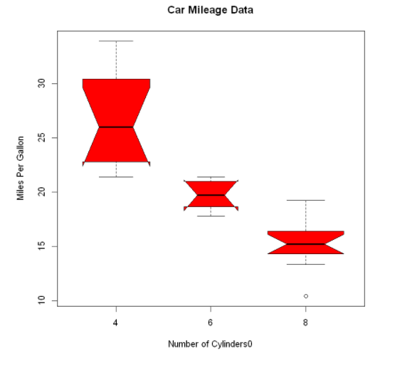
It can be seen that the median fuel consumption of four cylinder, six cylinder and eight cylinder models is different. With the reduction of the number of cylinders, the fuel consumption decreases significantly.
Box diagram of two cross factors ---- > two independent variables: cyl, am
cyl indicates the number of cylinders in the car, and am indicates whether the car is in automatic or manual gear
#Create a factor for the number of cylinders
mtcars$cyl.f <- factor(mtcars$cyl,
                       levels=c(4,6,8),
                       labels=c("4","6","8"))
#Create a factor for the transmission type
mtcars$am.f <- factor(mtcars$am,
                      levels=c(0,1),
                      labels=c("auto","standaard"))
#Draw box diagram
boxplot(mpg~am.f*cyl.f,
        data=mtcars,
        varwidth=TRUE,
        col=c("gold","darkgreen"),
        main="MPG Distribution by Auto Type",
        xlab="Auto Type",
        ylab="Miles Per Gallon")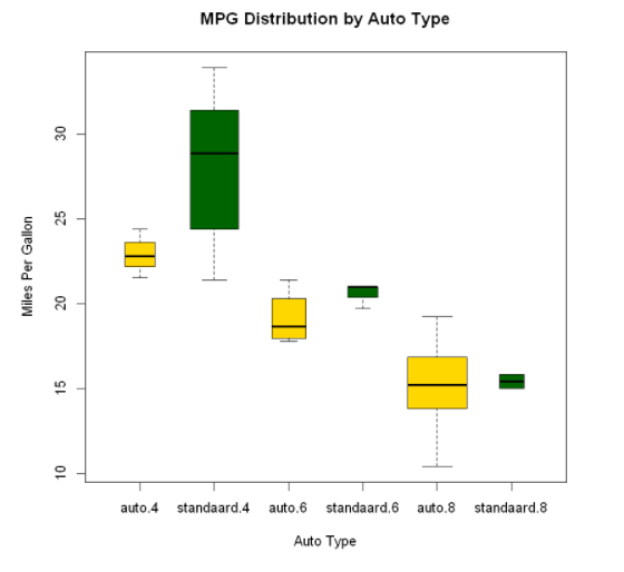
The figure clearly shows that the fuel consumption decreases with the decrease of the number of cylinders. For four cylinder and six cylinder models, the fuel consumption of the standard transmission is higher. But for the eight cylinder model, there seems to be no difference in fuel consumption. You can also see from the width of the box diagram.
Violin picture
Violin diagram is a combination of box diagram and kernel density diagram. You can draw it using the vioplot () function in the vioplot package.
The format of the vioplot() function is: vioplot(x1,x2,... ,names=, col=)
Where x1, x2,... Represent one or more numerical vectors to be drawn (a violin diagram will be drawn for each vector). The parameter names is the character vector of the label in the violin diagram, and col is a vector that specifies the color for each violin diagram.
#Load data
library(vioplot)
x1 <- mtcars$mpg[mtcars$cyl==4]   #Notice the square brackets
x2 <- mtcars$mpg[mtcars$cyl==6]
x3 <- mtcars$mpg[mtcars$cyl==8]

#Drawing violin
vioplot(x1,x2,x3,
        names=c("4 cyl","6 cyl","8 cyl"),
        col="gold")
title("Violin Plots of Miles Per Gallon",
      ylab="Miles Per Gallon" ,
      xlab= "Number of Cylinders")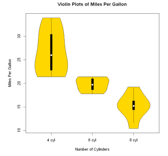
Violin diagram is basically the superposition of nuclear density diagram on box diagram in a mirror way. In the figure, the white dot is the median, the black box type ranges from the lower quartile to the upper quartile, the thin black line represents the beard, and the external shape is the estimation of nuclear density.
Point diagram
Dot charts provide a way to plot a large number of labeled values on a simple horizontal scale. You can use the dotchart() function to create a dot chart in the following format: dotchart(x,labels= )
Where x is a numeric vector, and labels is a vector composed of labels of each point. You can select a factor by adding the parameter groups to specify how the elements in X are grouped. If so, the parameter gcolor can control the color of different groups of labels, and cex can control the size of labels. Here is an example of the mtcars dataset:
dotchart(mtcars$mpg,
         labels=row.names(mtcars),
         cex=1.2,
         main="Gas Mileage for Car Models",
         xlab="Miles Per Gallon")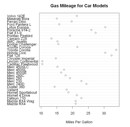
Point graph after grouping, sorting and coloring
x <- mtcars[order(mtcars$mpg),]  #The data frame mtcars is sorted by miles per gallon (from lowest to highest), and the result is saved as data frame x

x$cyl <- factor(x$cyl)  #Converts a numeric vector cy1 to a factor

x$color[x$cyl==4] <- "red"
x$color[x$cyl==6] <- "blue"
x$color[x$cyl==8] <- "darkgreen"
dotchart(x$mpg,
         labels=row.names(x),   #The label of each data point is taken from the row name (vehicle model) of the data frame
         cex=1.2,
         groups=x$cyl,    #Data points are grouped according to the number of cylinders
         gcolor="black",  #Digital color
         color=x$color,   #Color of points and labels
         pch=19,          #Set to display as solid dots
         main="Gas Mileage for Car Models",
xlab="Miles Per Gallon") 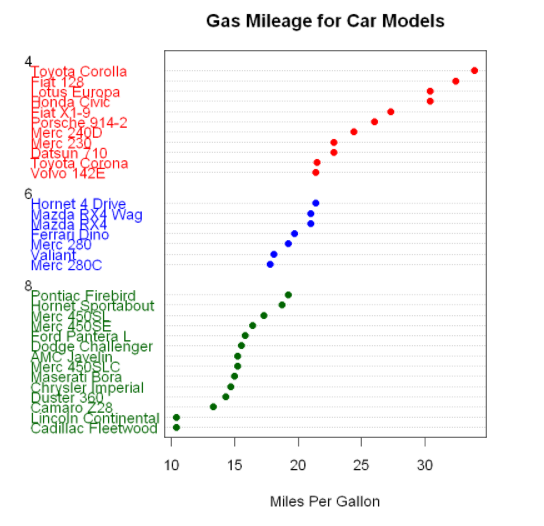
Again, as the number of cylinders decreases, the number of miles per gallon increases. But you also see exceptions. For example, Pontiac Firebird has eight cylinders, but has more miles than the six cylinder mercury 280C and Valiant. The six cylinder Hornet 4 Drive has the same miles per gallon as the four cylinder Volvo 142E. It is also obvious that Toyota Corolla has the lowest fuel consumption, while Lincoln Continental and Cadillac Fleetwood are outliers at the lower end of the mileage.
pch determines the style of points. The values of pch are as follows: