Window Insets for Android Compose
In addition to the content area of the app, some other fixed elements will be displayed on the mobile phone screen, including the status bar at the top, bangs, navigation bar at the bottom, and input method keyboard,
They are the UI of the system, also known as Insets
As shown in the figure:
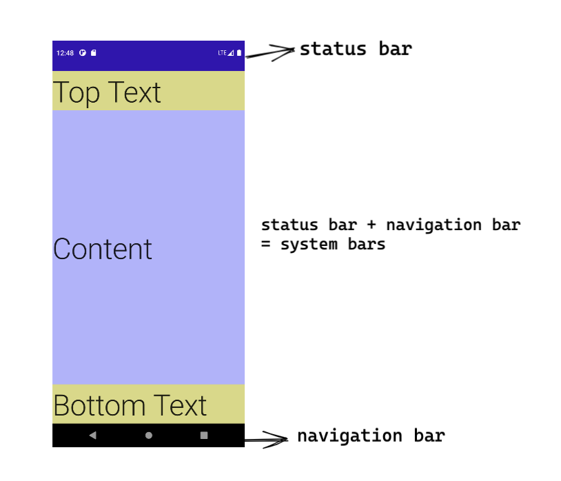
The status bar at the top is usually used to display notifications, equipment status, etc;
The bottom navigation bar usually displays three navigation buttons: back, home, recent
They are collectively called system bars
The Insets class of Android describes the offset size information. Indeed, we pay more attention to the size information of these system UI in our development
This article introduces that after using Compose as UI, with the help of Accompanist Insets: https://google.github.io/accompanist/insets/.
How to do several common situations related to Insets
Content area
Going Edge-to-Edge
Create a new App written in Compose. By default, it is an ordinary App without Inset processing
Can the content of the app be displayed in these system bars areas in the form of edge to edge?
Yes, of course
Two concepts are clarified here:
- Edge to edge: the content of app is drawn after system bars, which still exists in translucent form
- Different from the "immersive mode", the immersive mode needs to hide the system bars, and the app content is completely full screen. It is mostly used for watching videos, painting and other scenes
The content area extends to system bars
It's easy to extend the content to the status bar and navigation bar areas, just add one line of code:
WindowCompat.setDecorFitsSystemWindows(window, false)
The default value is true, indicating the default behavior: the content of the app will automatically find the embedded area to draw
When set to false, the content of the app will extend to the lower layer of system bars
The difference is shown in the following figure: the left is the default display, and the right is the situation after adding the setting of false flag:
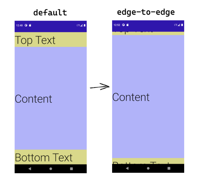
Well, the content is drawn out, but it is blocked
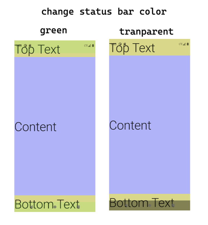
You need it at this time systemuicontroller To change the color:
Add these lines to change your favorite color:
val systemUiController = rememberSystemUiController()
val useDarkIcons = MaterialTheme.colors.isLight

SideEffect {
    systemUiController.setSystemBarsColor(
        color = Color.Green.copy(alpha = 0.1f),
        darkIcons = useDarkIcons
    )
}
system bars is changed here, that is, both status bar and navigation bar are changed There is also a separate method of changing only one
For demo, set the color to transparent green (as shown in the left figure);
Color may be used in normal application scenarios Transparent (as shown in the right figure)
Extended but embedded
After making the UI of several pages, I found that some contents were covered in the status bar and bottom, and the experience was not very good
Can you let out the part with text content?
Therefore, this dependency is added: Insets for Jetpack Compose
The distance between the top and bottom is left in two simple lines:
ProvideWindowInsets {
    Sample1(modifier = Modifier.systemBarsPadding())
}
Wait, if the setting of system bars color is ignored
It looks as like as two peas in the beginning.
So can we delete windowcompat directly Setdecorfitssystemwindows (window, false), just use the default setting?
- Yes If that's what you need
- no If you need to draw the app background; If you still have input box processing
If the requirement is to extend the background, the text is embedded
Add different padding to the upper and lower elements respectively:
Column(
        modifier = modifier.fillMaxSize()
                .background(color = Color.Blue.copy(alpha = 0.3f)),
        verticalArrangement = Arrangement.SpaceBetween
) {
    Text(
            modifier = Modifier.fillMaxWidth()
                    .background(color = Color.Yellow.copy(alpha = 0.5f))
                    .statusBarsPadding(),
            text = "Top Text",
            style = MaterialTheme.typography.h2
    )
    Text(text = "Content", style = MaterialTheme.typography.h2)
    Text(
            modifier = Modifier.fillMaxWidth()
                    .navigationBarsPadding()
                    .background(color = Color.Yellow.copy(alpha = 0.5f)),
            text = "Bottom Text",
            style = MaterialTheme.typography.h2
    )
}
After running, it is shown on the right in the figure below:
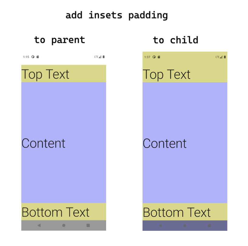
Note the order of modifier s here. The colors extending from top to bottom are different. The colors extending from bottom to top are actually the colors of columns
On the left is the case of adding insets padding to the overall layout. If system bars is used, the effect is the same as that of the default UI
The details can be customized according to the needs
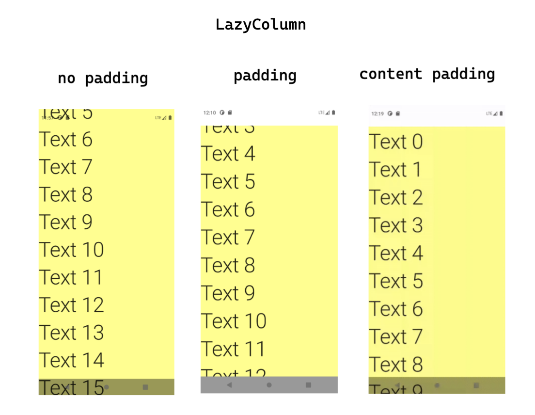
Padding and content padding of LazyColumn
There is a very long LazyColumn. How should it be displayed under the design of edge to edge?
There are three options:
- List full screen: LazyColumn {}
- List padding: LazyColumn(modifier = Modifier.systemBarsPadding()) {}
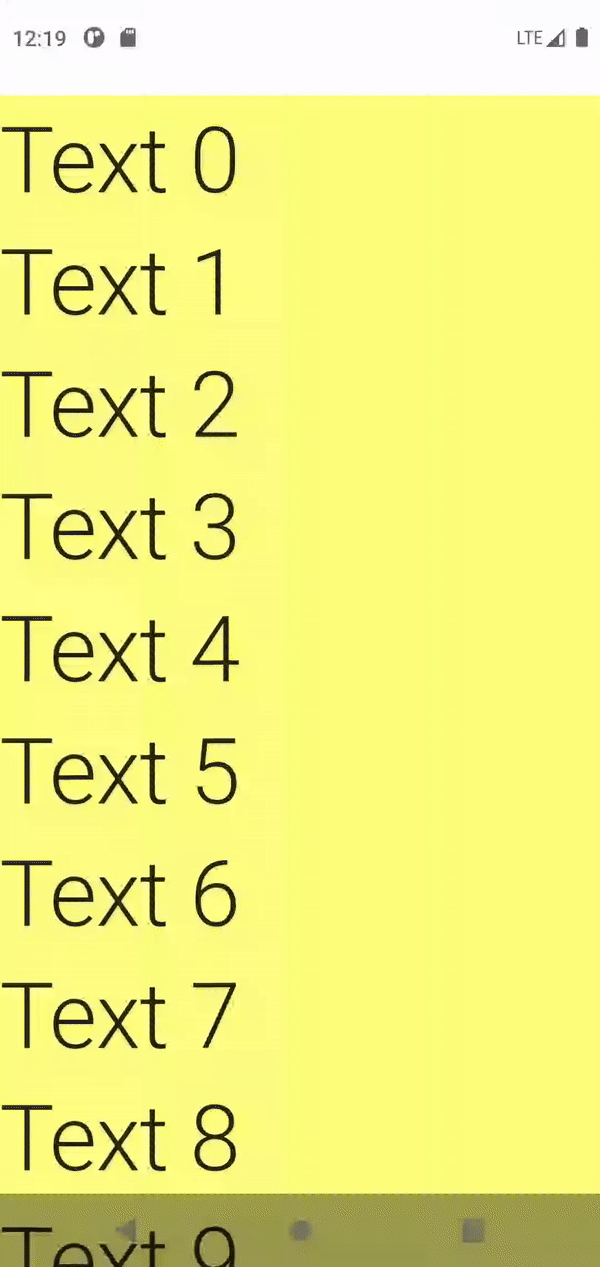
- List Content padding:
LazyColumn(
    contentPadding = rememberInsetsPaddingValues(
        insets = LocalWindowInsets.current.systemBars,
        applyTop = true,
        applyBottom = true,
    )
) {}
In fact, the behavior of 1 and 2 is very similar, only the difference of display area size
content padding just adds padding above the first item and below the last item,
In the middle of scrolling, the content can be full screen, and padding will be displayed only at the end or in the end
content padding can better illustrate the situation with dynamic diagram:
Content area processing summary
Insets library provides several modifiers:
- Modifier.statusBarsPadding()
- Modifier.navigationBarsPadding()
- Modifier.systemBarsPadding()
- Modifier.imePadding()
- Modifier.navigationBarsWithImePadding()
- Modifier.cutoutPadding()
You can use it directly in the layout to get the required padding. For example, statusBarPadding is top and navigationbarspadding is bottom
This does not need developers to think for themselves
If none of these can meet your needs, you can also directly use the size:
- Modifier.statusBarsHeight()
- Modifier.navigationBarsHeight()
- Modifier.navigationBarsWidth()
Or more directly use localwindowinsets Current gets the relevant dimensions of the inset type you want
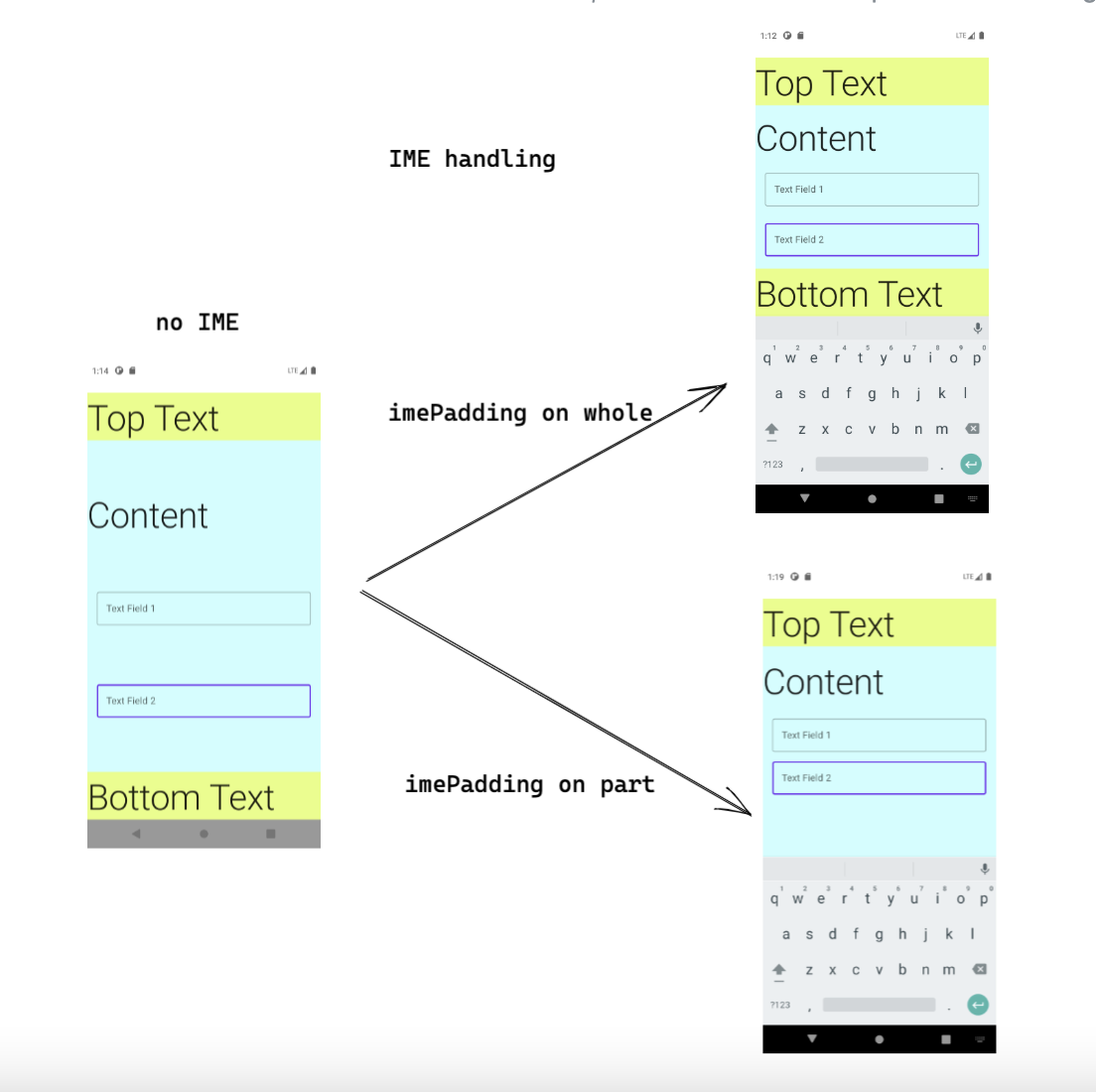
Input box elements and keyboard
On screen keyboard, also known as IME (Input Method Editor),
Generally, clicking the input box will pop up. IME is also an Inset
The input box is blocked by the keyboard
When the input box is in the upper half of the screen, there is basically no need to consider the problem of keyboard occlusion
But when the input box is in the lower half of the screen, we need to make the input box fully displayed without being covered when the keyboard pops up
To solve this problem, we need several things:
- android:windowSoftInputMode="adjustResize" of Activity indicates that when the keyboard pops up, the Activity will change the layout size, which is extruded
- Modifier. The use of imepadding adds a bottom padding that is exactly equal to the height of the keyboard to the layout It is usually for the parent layout of the input box, which layer to add depends on the situation
- If the above two settings still fail to fully display the input box, it may be necessary to add some powerful wake-up behavior
According to this issue This comment,
You can use this Modifier to bring yourself into view when the ui gets the focus
@ExperimentalComposeUiApi
fun Modifier.bringIntoViewAfterImeAnimation(): Modifier = composed {
    val imeInsets = LocalWindowInsets.current.ime
    var focusState by remember { mutableStateOf<FocusState?>(null) }
    val relocationRequester = remember { RelocationRequester() }

    LaunchedEffect(
        imeInsets.isVisible,
        imeInsets.animationInProgress,
        focusState,
        relocationRequester
    ) {
        if (imeInsets.isVisible &&
            !imeInsets.animationInProgress &&
            focusState?.isFocused == true) {
            relocationRequester.bringIntoView()
        }
    }

    relocationRequester(relocationRequester)
        .onFocusChanged { focusState = it }
}
The relocationrequest has been deprecated. The new version of Compose is called BringIntoViewRequester
IME padding calculation and layout
The value of. imePadding() changes. It is 0 without a keyboard. When there is a keyboard, it changes to the keyboard height
To calculate the pop-up height of the keyboard, pay attention to:
- In the simplest case, use it directly When imePadding() is finished, the bottom padding of the layout will automatically fit with IME
- If the whole has a height of navigation bar, you can consider using it Navigationbarswithmepadding(), which is the maximum value of IME and navigation bar height
- If a white note appears on the top of the keyboard, it indicates that there are too many padding. Either there is inner padding in the layout or navigationBarsPadding has been added At this time, you can do a subtraction by yourself
For example:
LazyColumn(
    contentPadding = PaddingValues(
        bottom = with(LocalDensity.current) {
            LocalWindowInsets.current.ime.bottom.toDp() - innerPadding.bottom
        }.coerceAtLeast(0.dp)
    )
) { /* ... */ }
Where. imePadding is placed is related to what kind of area will be displayed, and the wrapped area will be displayed above the keyboard
For example, there is an interface with input box
Let's set a whole for it Navigationbarswithmepadding(), indicating that when there is no keyboard, the height of the navigation bar is reserved at the bottom. When there is a keyboard, the height of the keyboard is reserved:
Column(
    modifier = Modifier.fillMaxSize().statusBarsPadding().navigationBarsWithImePadding()
        .background(color = Color.Cyan.copy(alpha = 0.2f)),
    verticalArrangement = Arrangement.SpaceBetween
) {
    Text(
        modifier = Modifier.fillMaxWidth()
            .background(color = Color.Yellow.copy(alpha = 0.5f)),
        text = "Top Text",
        style = MaterialTheme.typography.h2
    )
    Text(text = "Content", style = MaterialTheme.typography.h2)
    MyTextField("Text Field 1")
    MyTextField("Text Field 2")
    Text(
        modifier = Modifier.fillMaxWidth()
            .background(color = Color.Yellow.copy(alpha = 0.5f)),
        text = "Bottom Text",
        style = MaterialTheme.typography.h2
    )
}
When the keyboard pops up, the Bottom Text will also be pushed up, because imePadding acts on the layout of the whole block
If we change this way and only wrap the part of the input box, the keyboard will not top up the UI at the bottom:
    Column(
        modifier = Modifier.fillMaxSize().statusBarsPadding()
            .background(color = Color.Cyan.copy(alpha = 0.2f)),
        verticalArrangement = Arrangement.SpaceBetween
    ) {
        Text(
            modifier = Modifier.fillMaxWidth()
                .background(color = Color.Yellow.copy(alpha = 0.5f)),
            text = "Top Text",
            style = MaterialTheme.typography.h2
        )
        Text(text = "Content", style = MaterialTheme.typography.h2)

        Text(
            modifier = Modifier.fillMaxWidth()
                .background(color = Color.Yellow.copy(alpha = 0.5f)),
            text = "Bottom Text",
            style = MaterialTheme.typography.h2
        )
    }
The two effects are shown in the figure below:
Summary and extension of keyboard part
Summary: the processing of input box keyboard includes:
- adjustResize.
- Set reasonable bottom padding: where to set and how much to set
- Let the View actively bring itself to the visible position
Insets library also provides examples of keyboard disappearing and appearing with scrolling If you are interested, you can have a look
Summary of the use of acompanist insets
The acompanist insets library helps us do two parts:
- Obtain various insets information and provide it with CompositionLocalProvider
- Inside the Provider, the directly available modifier or size can be obtained through the modifier
However, there are some points that need attention when using this library, such as:
- If you forget to set windowcompat Setdecorfitssystemwindows (window, false), the obtained values are 0
- Parameter of providedwindowinsets: consumewindowninsets is true by default. It is recommended to set it to false to facilitate the inner ui to continue to use the values of these insets
@Composable
fun ProvideWindowInsets(
    consumeWindowInsets: Boolean = true,
    windowInsetsAnimationsEnabled: Boolean = true,
    content: @Composable () -> Unit
)
- If providedwindowinsets are nested in the layout, it may not work as expected (I don't know if it is a temporary issue)