In the first part Quick start of Jetpack Compose Technology In this article, we briefly introduced Compose, so let's learn the layout of Compose. Since the layout involves a lot of content, it will be written separately.
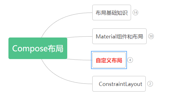
The layout mainly includes: Layout Basics,Material components and layout , custom layout Use ConstraintLayout in Compose.
Knowledge points involved in custom layout:
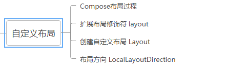
Composition layout process
In Compose, interface elements are represented by composable functions. After being called, such functions will emit part of the interface, which will then be added and presented in the interface tree on the screen. Each interface element has a parent element and possibly multiple child elements. In addition, each element has a position in its parent element, designated as (x, y) position; There is also a dimension, which is specified as width and height.
The parent element defines the constraints of its child elements. The element needs to define dimensions within these constraints. Constraints can limit the minimum and maximum width and height of an element. If an element has child elements, it may measure each child element to help determine its size. Once an element determines and reports its own size, there is an opportunity to define how to place its child elements relative to itself.
The process of arranging each node in the interface tree is divided into three steps:
1. Measure all sub items
2. Determine your own size
3. Place its children
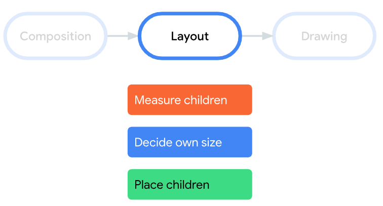
★ note: multiple measurements are not allowed on the Compose interface. This means that layout elements cannot measure any child elements multiple times in order to try different measurement configurations.
Extended layout modifier layout
Use the layout modifier to modify how elements are measured and laid out. Layout is a lambda; Its parameters include the elements you can measure (passed as measurable) and the incoming constraints of the composable item (passed as constraints). Custom layout modifiers may be as follows:
fun Modifier.customLayoutModifier(...) =
    this.layout { measurable, constraints ->
        ...
    })
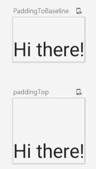
Take the top inner margin of Text as an example. If there is such a demand: set the inner margin with the baseline of the first line of Text as the reference, as shown in the figure below:
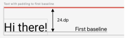
Text position Y = set height - text height
The code is as follows:
/**
 * 1.Custom layout modifier - modifies the distance between the text baseline and the top
 */
fun Modifier.firstBaselineToTop(firstBaselineToTop: Dp)=layout { measurable, constraints ->
    //First measure
    val placeable = measurable.measure(constraints)
    check(placeable[FirstBaseline] != AlignmentLine.Unspecified)
    val firstBaseLine = placeable[FirstBaseline]
    //Text position Y
    val placeableY = firstBaselineToTop.roundToPx() - firstBaseLine
    val height = placeable.height + placeableY
    //Rearrange
    layout(placeable.width,height){
        placeable.placeRelative(0,placeableY)
    }
}
The final effect is compared with the padding effect, as shown in the following figure:
Create custom Layout
In the Android View system, if you want to customize the layout, you must inherit the ViewGroup and implement the measurement and layout functions. However, customizing the layout in Compose is much simpler, which can be realized directly by using the layout composable items. Layout allows manual measurement and layout of children. Column and Row are built from layout.
Pay attention to distinguish it from the layout in the custom modifier.
Let's take a custom vertical layout as an example (similar to Column). The code is as follows:
/**
 * 2.Customize Layout to realize vertical Layout of components
 */
@Composable
fun MyBasicColumn(
    modifier: Modifier = Modifier,
    content:@Composable ()->Unit
){
    //Step 1:
    //Where measures and constraints are the lambda writing method of the last parameter of Layout
    Layout(content = content, modifier = modifier){ measurables,constraints ->
        //Step 2: measure the component through the constraints of the given point
        val placeables = measurables.map {
            it.measure(constraints)
        }
        //Gets the sum of the heights of all elements
        val wrapHeight = placeables.sumOf {
            it.height
        }
        //Step 3: layout, set the allowable layout size
        layout(constraints.maxWidth,wrapHeight){
            var yPosition = 0
            //Step 4: set the position of each component
            placeables.forEach {placeable->
                //Set the x,y coordinates of the component
                placeable.placeRelative(x = 0,y=yPosition)
                //Calculate the y coordinate of the next component
                yPosition += placeable.height
            }
        }
    }
}
It is worth noting that layout is similar to the layout modifier, but the first parameter measures is a list of children to be measured, and constraints are constraints from the parent.
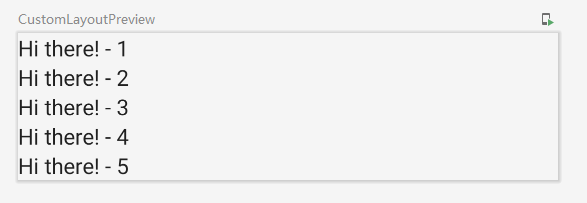
The example effect is as follows:
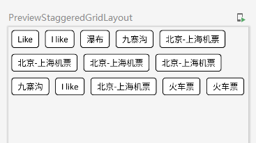
In addition, there is a custom one here Waterfall flow layout , those who are interested can have a look.
design sketch:
Layout direction
If you need to change the direction of the layout, you can use LocalLayoutDirection. The layout directions that can be modified are LTR (from left to right) and RTL (from right to left).
Examples are as follows:
/**
 * 3.Layout direction
 */
@Composable
fun ChangeColumnDirection(){
    CompositionLocalProvider(LocalLayoutDirection provides LayoutDirection.Rtl ) {
        Column(Modifier.fillMaxWidth()) {
            Text("Title")
            Text("Subtitle")
        }
    }
}
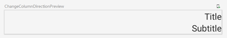
Example effect:
Here is the introduction of custom layout, which is relatively less.