In Flutter, Stateless Widget and Stateful Widget are classified according to whether the component itself is stateless or not.
In Widget s, there are button s or widgets representing structural elements, font s and color s representing styles, widgets for padding layout, and widgets creating their own widgets by extending existing widgets.
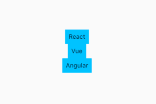
 DecoratedBox(
   decoration: BoxDecoration(color: Colors.lightBlueAccent),
  child: Padding(padding: const EdgeInsets.all(8.0),child: Text('React'),),
  ),
DecoratedBox allows us to add a style Box, modify the color of DecoratedBox by giving it a color value, and then add Padding Widget to the child attribute to wrap the Text Widget to add some inner margins to the Text. Together, these components form a combination of components. Each component has a complete independent task and achieves a single responsibility.
import 'package:flutter/material.dart';
import 'package:flutter/foundation.dart';

void main() => runApp(const MyApp());

class MyApp extends StatelessWidget {
  const MyApp();

  @override
  Widget build(BuildContext context) {
    // TODO: implement build
    return MaterialApp(
        title: 'my tut app',
        home: Scaffold(
          appBar: AppBar(
            title: Text("tuts"),
          ),
          body: Center(

            child:Column(
              mainAxisAlignment: MainAxisAlignment.center,
              children: <Widget>[
                DecoratedBox(
                  decoration: BoxDecoration(color: Colors.lightBlueAccent),
                  child: Padding(padding: const EdgeInsets.all(8.0),child: Text('React'),),
                ),
                DecoratedBox(
                  decoration: BoxDecoration(color: Colors.lightBlueAccent),
                  child: Padding(padding: const EdgeInsets.all(8.0),child: Text('Vue'),),
                ),
                DecoratedBox(
                  decoration: BoxDecoration(color: Colors.lightBlueAccent),
                  child: Padding(padding: const EdgeInsets.all(8.0),child: Text('Angular'),),
                ),
              ],
            )

          ),
        ));
  }
}
They can be separated by adding SizeBox, giving each other a certain gap. We can control StatelessWidget by passing in parameters
class TutTitle extends StatelessWidget{ final String title; const TutTitle(this.title); @override Widget build(BuildContext context) { // TODO: implement build return DecoratedBox( decoration: BoxDecoration(color: Colors.lightBlueAccent), child: Padding(padding: const EdgeInsets.all(8.0),child: Text(title),), ); } }
We can define the content of Text by passing title as a constructor parameter into StatelessWidget, which will not redraw the interface based on its own data changes.
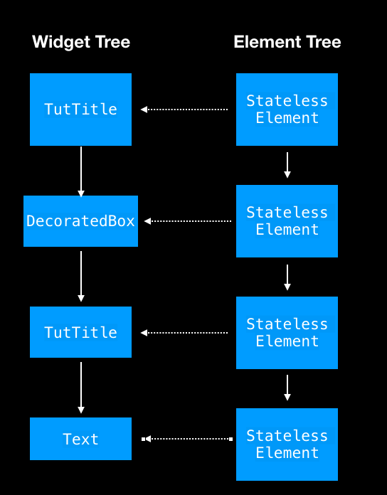
So how do we draw a defined widget to the interface? In fact, the Widget Tree corresponds to an Element Tree, which renders the widget to the interface. Each Widget has an Element and creates an instance of the Element.
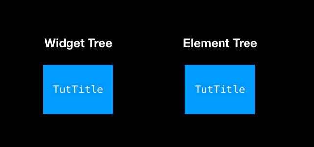
@override StatelessElement createElement() => new StatelessElement(this);
StatelessWidget corresponds to a StatelessElement. When StatelessWidget is bound to Widget Tree, the above createElement method is called to create StatelessElement. When Flutter starts, it queries the Element tree, and each Element has a reference to the Widget.
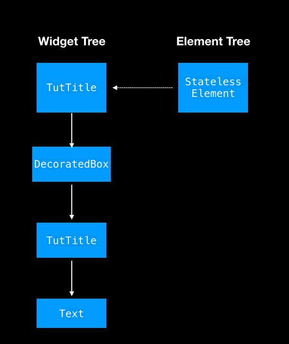
When the build method is invoked, Widgets are bound to Widget Tree layer by layer, and Element s are created one by one to refer to Widgets.