The Matplotlib library is a package used in Python to draw pictures, which can be used to quickly draw the desired image
Catalog
(2) Subgraph and Subgraph Layout
(3) Name of coordinate axis and scale
Text labeling (Chinese & English)
Some parameter settings in the polar axis
Radar Mapping in Polar Coordinates
1.Installation Configuration
Open Pycharm -->Click File
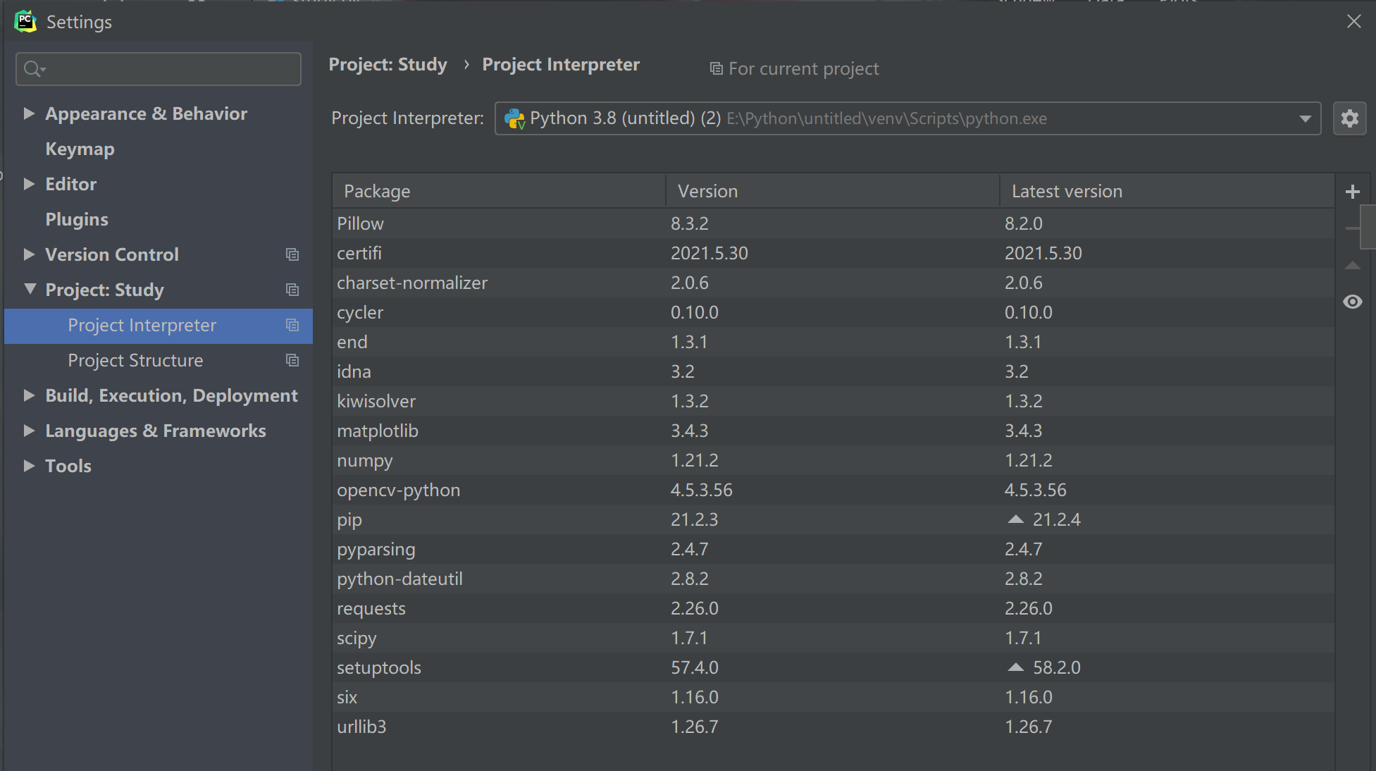
Click Settings --> Click Project Interpreter
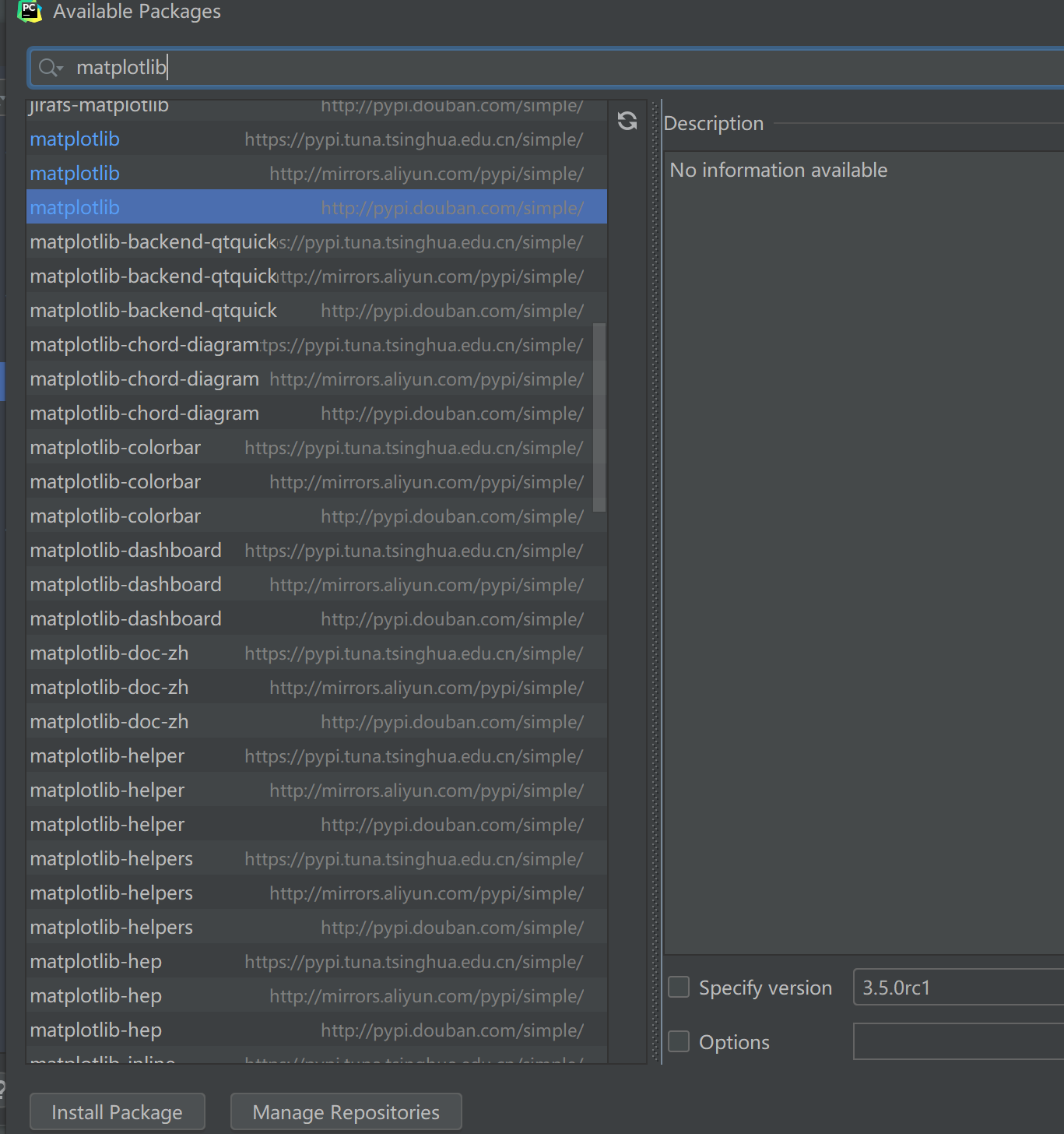
Click + to search and install
2.quick get start
(1) Canvas
Function: figure (num =, figsize =, DPI =, facecolor =, edgecolor =, frameon =) can be used in the matplotlib Library
Parameters:
- num: Used to uniquely label a canvas. You can enter an integer or string.
- figsize: Enter a tuple of two elements to define the length and width of the canvas. Default (6.4,4.8).
- dpi: Image resolution, default value is 100.
- facecolor: Background color. Default: rc:figre.facecolor'='w'
- edgecolor: Border color. If not provided, default is rc:figre.edgecolor'='w'
- frameon: Display of graphical frames
Reference article here: Matplotlib(2) - Creating Canvas
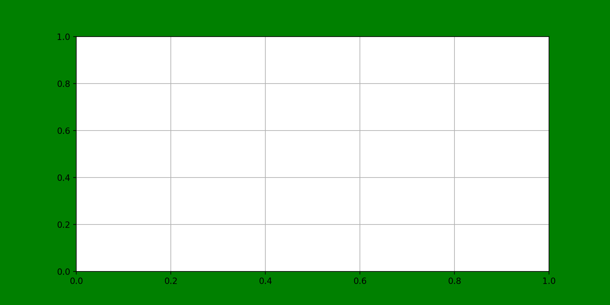
For example:
import matplotlib.pyplot as plt
fig1 = plt.figure(figsize=(10, 5), dpi = 300, facecolor = 'g')
plt.grid()                                       #Draw grid lines
plt.title('A green photo')
plt.savefig('E:\Python\ StudyOfMatplotlib')      #Storage path for pictures
plt.show()
The resulting image will look like the following:
(2) Subgraph and Subgraph Layout
Draw two or more pictures in the same picture
subplot()
Usage: subplot (row, column, current picture number)
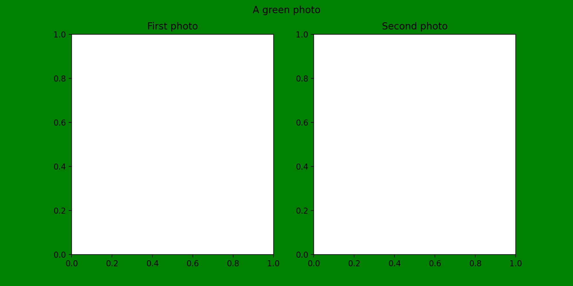
import matplotlib.pyplot as plt
fig1 = plt.figure(figsize=(10, 5), dpi = 200, facecolor = 'g', edgecolor = 'b')
plt.suptitle('A green photo')                   # Add Main Title
kfig1 = plt.subplot(1, 2, 1)
plt.title('First photo')                        #Add Subtitle
kfig2 = plt.subplot(1, 2, 2)
plt.title('Second photo')
plt.savefig('E:\Python\StudyOfMatplotlib\ green')
plt.show()
You can get the following images:
Of course, you can add other types of coordinate systems, such as polar coordinates:
plt.subplot(133, projection = 'polar')
Then you can get the following canvas forms: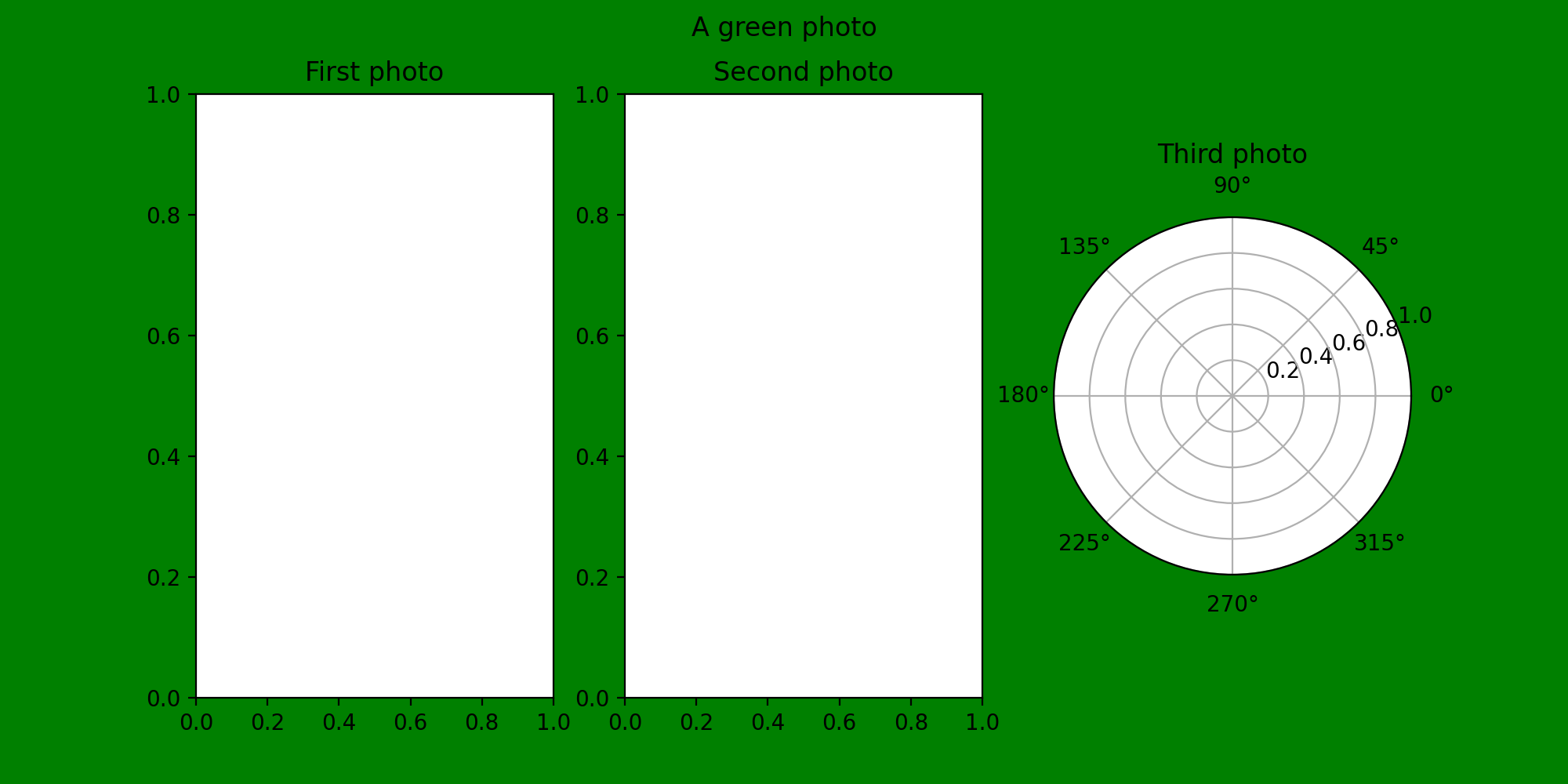
subplots()
The type of value returned is a tuple, which contains two elements: the first is a canvas, the second is a subplot, and the subplots parameter is similar to subplots. Both can plan the configuration to be divided into n subgraphs, but each subplot command will only create one subgraph, and one subplots will create all the subgraphs.
Function: subplots(nrows=1, ncols=1, sharex=False, sharey=False, squeeze=True, subplot_kw=None, gridspec_kw=None, **fig_kw)
Parameters:
-nrows / ncols: The number of subgraphs split on rows and columns
sharex / sharey: Coaxial or not. Optional:'none','all','row','col','True','False'
- all / True: all subgraphs share axes
- none / False: each has its own axis
- row / col: share x,y axis by subgraph row or column
squeeze: Whether axes should be compressed into a one-dimensional array when multiple subgraphs are returned
subplot_kw: Create a keyword dictionary for subplot
**fig_kw: Other keywords when creating a configuration
Usage:
x = np.arange(0, 100)
y = np.sin(0.1*np.pi*x)
fig4, axes = plt.subplots(2, 2, dpi  = 300, facecolor = 'g')
axes[0, 0].plot(y, 'b')
axes[0, 0].grid(color = 'r', linestyle = '--', linewidth = 1)
plt.savefig('E:\Python\StudyOfMatplotlib\ kidstable')
You can get the following images:
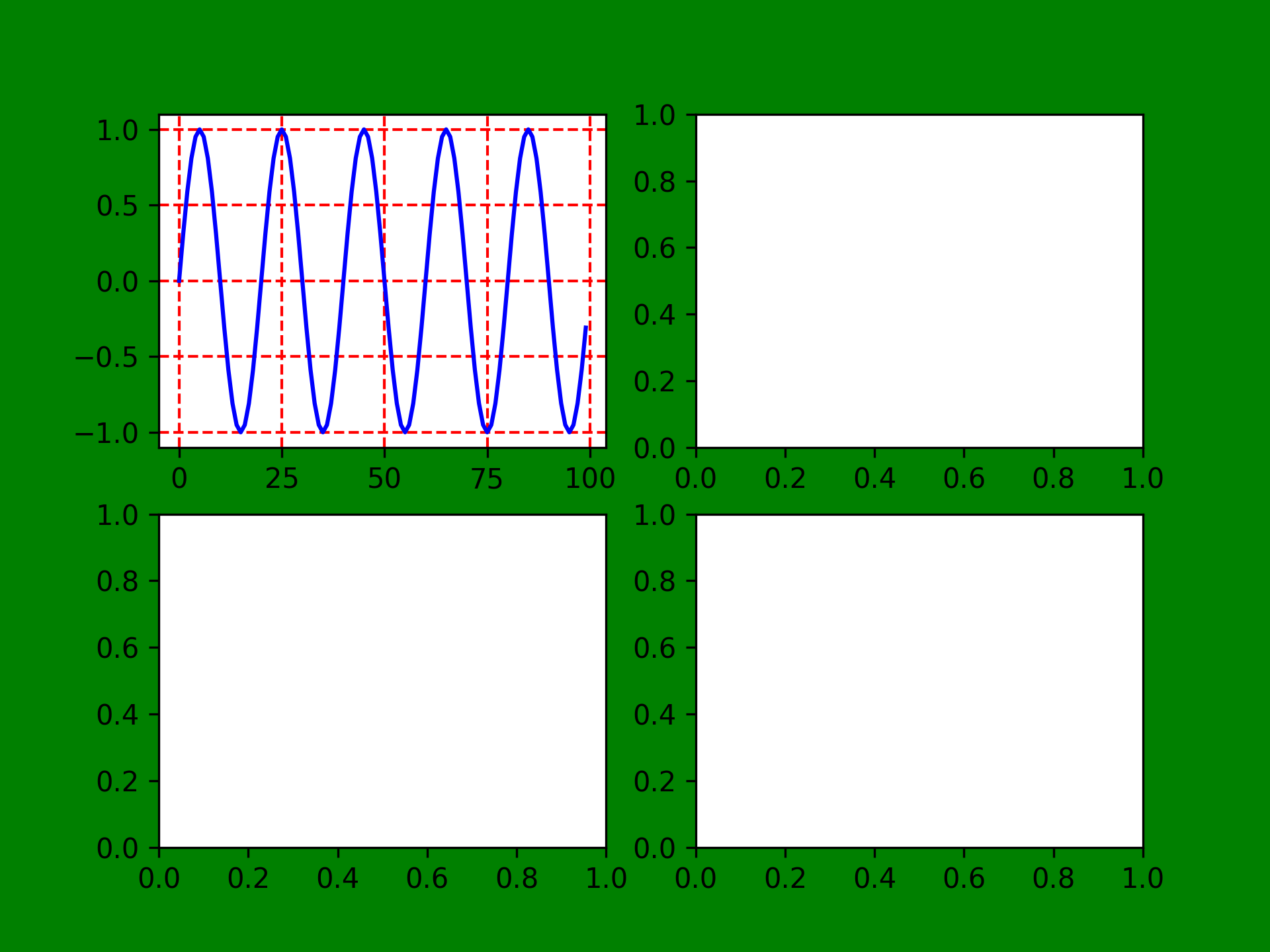
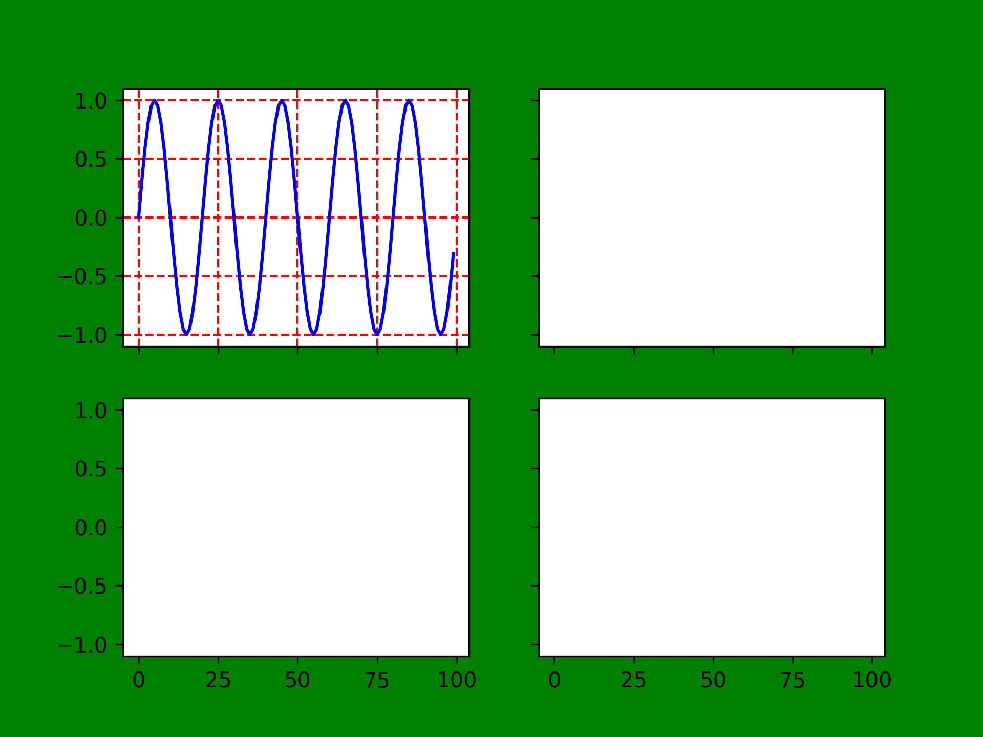
You can see that there is no common x- or y-axis in the above image, so try using the same axis below:
Actually, just add sharex ='all', sharey ='all'
fig4, axes = plt.subplots(2, 2, dpi = 300, facecolor = 'g',sharex = 'all', sharey = 'all')
(3) Name of coordinate axis and scale
Axis name
First, you can use simple xlabel and ylabel to name coordinate axes, such as:
fig1 = plt.figure(figsize=(10, 5), dpi = 200, facecolor = 'g', edgecolor = 'k')
plt.suptitle('A green photo')
kfig1 = plt.subplot(1, 3, 1)
plt.xlabel('x/(0 ~ 100)')
plt.ylabel('y/(0 ~ 100)')
plt.title('First photo')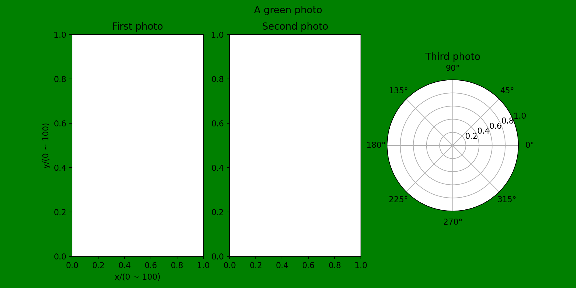 Coordinate axis range
For example, we want to draw a function in (-10, 10), but the default range in an image is not what we expected, so we need to set the range of the coordinate axis.
xlim & ylim
First, we can use the xlim and ylim commands to limit the extent of the coordinate axis
Or take the previous pattern as an example:
fig1 = plt.figure(figsize=(10, 5), dpi = 200, facecolor = 'g', edgecolor = 'k')
plt.suptitle('A green photo')
kfig1 = plt.subplot(1, 3, 1)
plt.xlabel('x/(0 ~ 100)')
plt.ylabel('y/(0 ~ 100)')
plt.xlim(-10, 10) #Restrict x-axis
plt.ylim(-100, 100) #Restrict y-axis
plt.title('First photo')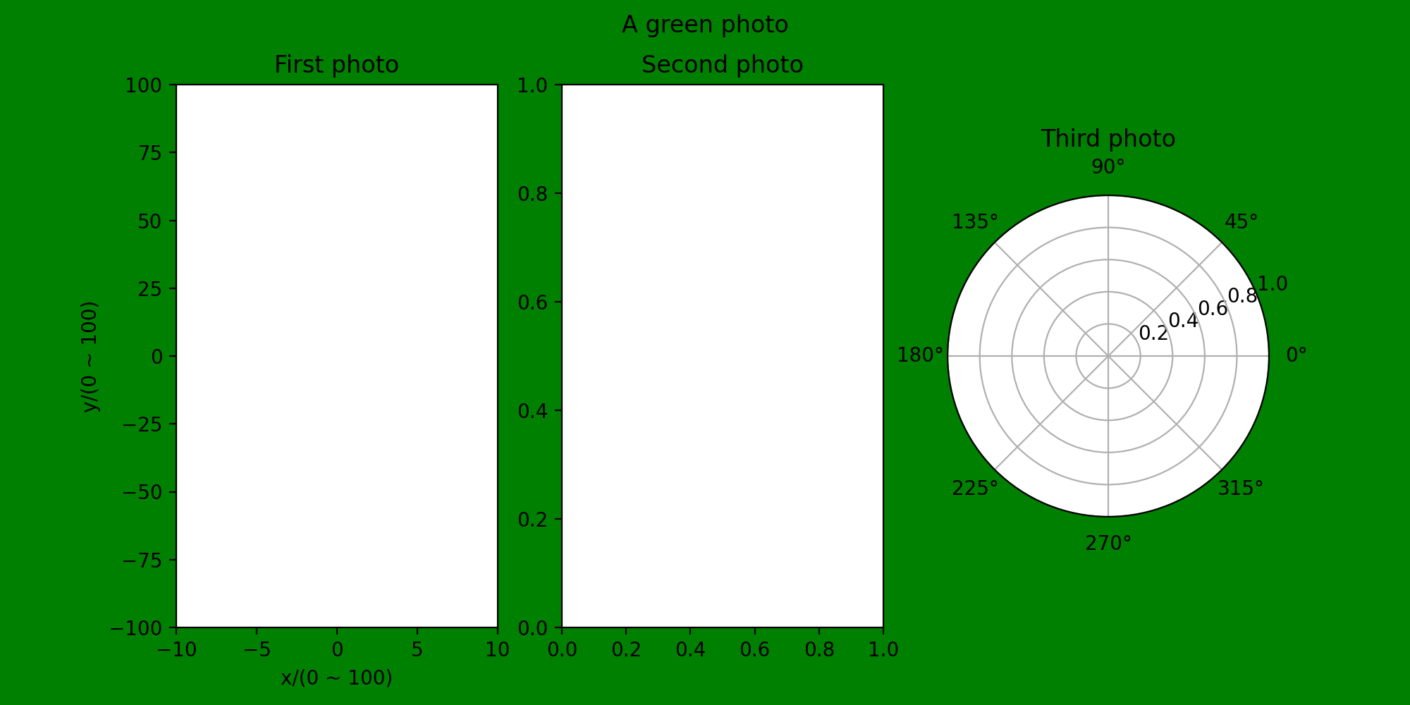 You can see that the x- and y-axes in The first photo have been restricted
xticks & yticks
Xlim & ylim can basically set only the range of coordinate axes, while xticks and yticks can set both the range and the spacing between each scale, so using xticks & yticks is much more convenient and effective than Xlim & ylim
Modify the second subgraph of the previous image:
kfig2 = plt.subplot(1, 3, 2)
plt.xticks(range(-10, 10, 2))    #Restrict x-axis to 2 units
plt.title('Second photo')
You can see that the x in the second subgraph is restricted
Xticks & yticks uses more than this, and can include additional commands to fulfill specific functional requirements:
Adding rotation to this statement can change the angle of the scale of the coordinate axis
plt.xticks(range(-10, 10, 2), rotation = 30) #Tilt 30 degrees
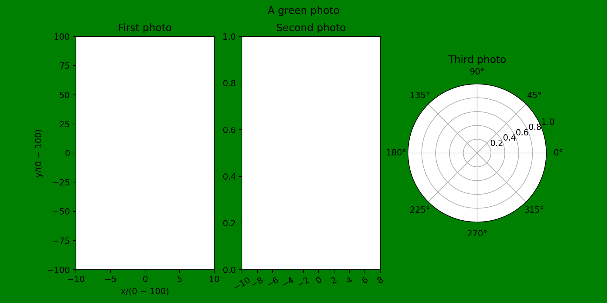
You can see that the bottom code is tilted at an angle
It can also be used to perform data analysis for December of the year:
plt.xticks(np.arange(12), calendar.month_name[1:13], rotation = 30)
calendar is a third-party library that needs to be referenced
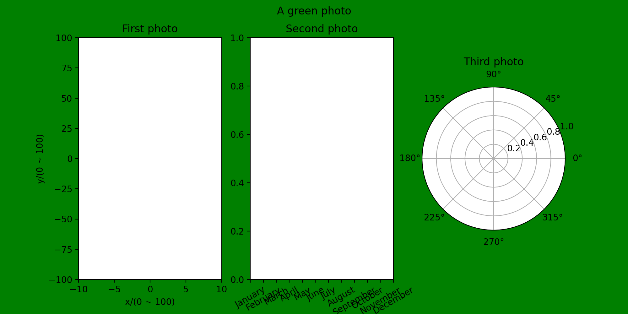 The horizontal coordinates in the second image have changed
(4) Legends and text labels
Legend
Reference here: 3.Matplotlib Configuration Legend and Color Bar
First let's try to create a simple legend
x = np.arange(0, 100)
y = np.sin(0.1*np.pi*x)
y2 = 0.5*np.random.randn(100)
plt.style.use('classic')
fig5, axes = plt.subplots(dpi = 300, facecolor = 'w')
plt.title('legend')
axes.plot(y, '-b', label = 'sin')
axes.plot(y2, '--r', label = 'random')
axes.legend()
plt.savefig('E:\Python\StudyOfMatplotlib\ legend')
plt.show()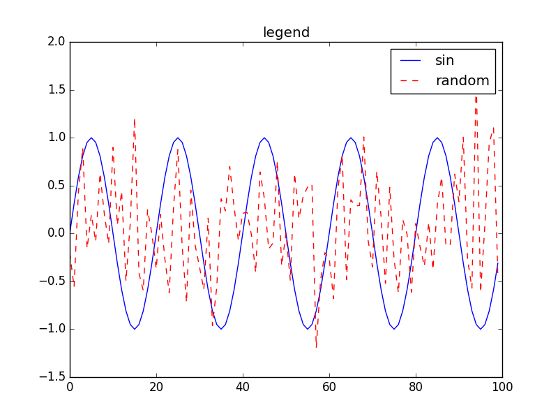 As you can see, legends are added to the top right corner by default and can be positioned to adjust
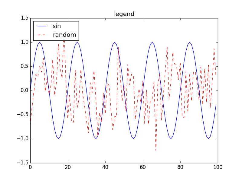
Add the above code as follows
axes.legend(loc = 'upper left')
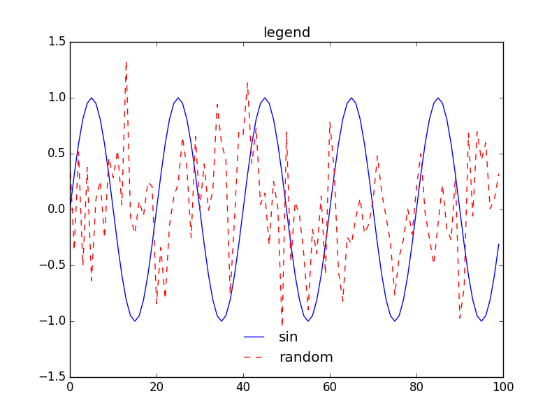
 There are borders in the previous legends, so we can try to get rid of them.
Or modify it in the legend statement:
axes.legend(loc = 'lower center', frameon = False)
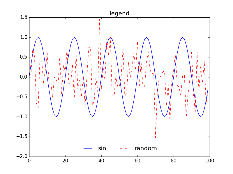
 You can also modify the number of columns displayed in the legend
Using the ncol function:
axes.legend(loc = 'lower center', frameon = False, ncol = 2)
 Text labeling (Chinese & English)
For curves drawn in a graph, we may sometimes need to add text for labeling, such as specifying a particular curve and labeling its function expression
Since Matplotlib does not support Chinese when adding text to a drawing, we first need to make it support Chinese. You can use the following command plt.rcParams['Attribute'] ='Attribute Value'to modify the global font
Reference here: Matplotlib: Text label, Annotation label
plt.rcParams['font.family'] = 'SimHei'       #Change global font to bold
x = np.arange(0, 100)
y = np.sin(0.1*np.pi*x)                      #Generate sinusoidal signal
y2 = 0.5*np.random.randn(100)                #Generate a random signal
plt.style.use('classic')
fig5, axes = plt.subplots(dpi  = 300, facecolor = 'g')    #Create Canvas
plt.title('Legend and Text', fontproperties = 'SimHei')         #Canvas Naming
axes.plot(y, '-b', label = 'sin')                         #Draw Image
axes.plot(y2, '--r', label = 'random')
plt.xlabel('x axis', fontproperties = 'SimHei')              #Bold Named x-axis
plt.ylabel('y axis', fontproperties = 'SimHei')
plt.xticks(range(0, 100, 10))                             #Restrict Axis Units
plt.yticks(range(-2, 2, 1))
axes.legend(loc = 'lower center', frameon = False, ncol = 2)  #Add Legend
plt.grid(True)                                                #Add a square
plt.savefig('E:\Python\StudyOfMatplotlib\ legend')     #Store the image, modify this line if you need to copy the code
plt.show()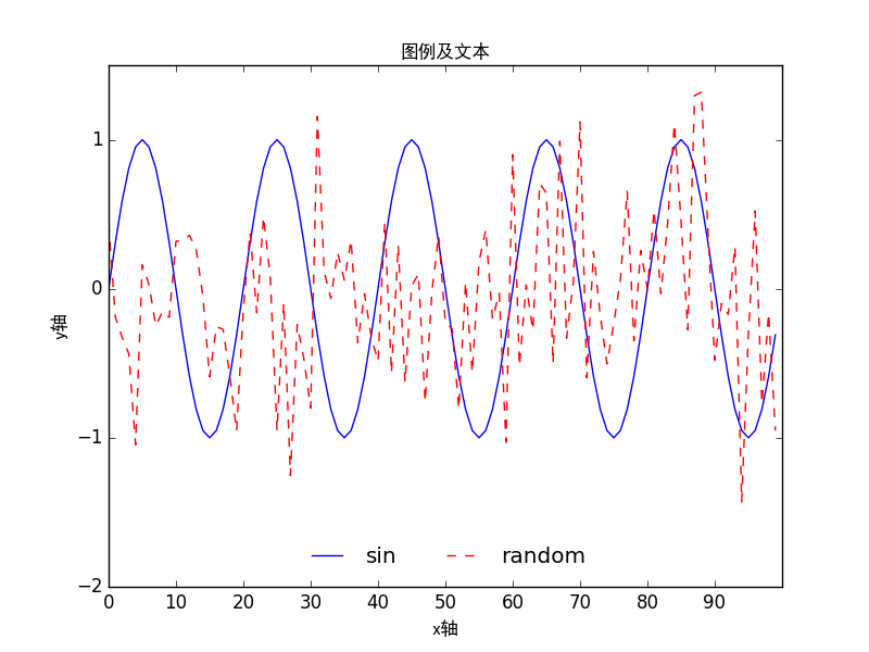
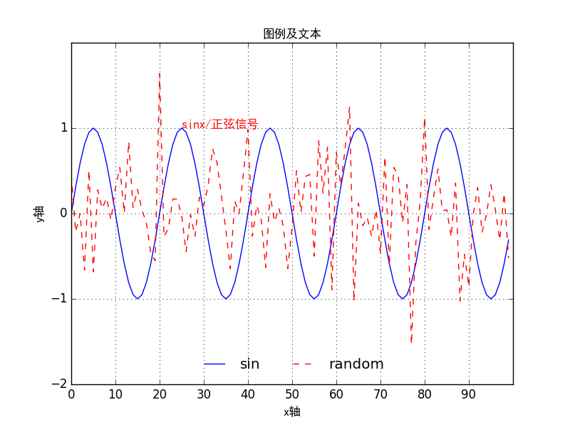
As you can see, the gallery now supports Chinese annotations and image titles can be in Chinese
Next, we try to label the sinx signal and the sinx signal in Chinese.
In fact, just add plt.text(x, y, r "name"), where x&y represents the coordinate point
plt.text(25, 1, r"sinx/sinusoidal signal", color = 'r', fontproperties = 'SimHei')
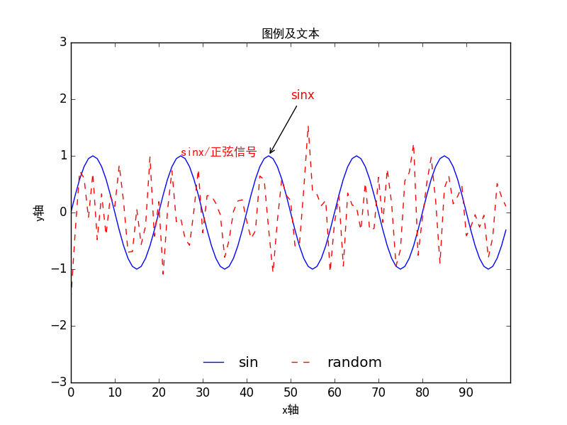
But if you have more than one curve in a graph, labeling can be confusing, so you can also try adding arrows to determine which curve is represented.
Let's try labeling the sinusoidal signal with an arrow
You can add arrows using the plt.annotate() function
plt.annotate(text ='sinx', xy=(45, 1), xytext = (50, 2), arrowprops={'arrowstyle':'->'}, color = 'r')
xy = (45, 1): the coordinate point of the arrow
xytext(50, 2): the coordinate point of the label's position
3.Graphic Drawing
Use the drawing gallery to quickly draw the type of image you want
If you want to solve the display problem in Chinese, you need to refer to the code below.
plt.rcParams['font.family'] = 'SimHei'       #Change global font to bold
plt.rcParams['axes.unicode_minus'] = False   #Normal use meets negative sign
(1) Curve charts
Take drawing a sine function as an example:
plt.rcParams['font.family'] = 'SimHei'       #Change global Chinese font to bold
plt.rcParams['axes.unicode_minus'] = False
fig6, axes = plt.subplots(figsize=(10, 10), dpi = 300, facecolor = 'w')  #Create a canvas 10 by 10 with a resolution of 300 and a white bottom color
plt.title('Curve practice', fontproperties = 'SimHei', color = 'k')                       #Set Title
x = np.arange(0, 100)                      #Determine the range of x
plt.xlim(0, 100)                           #Restrict x-axis range
plt.ylim(-2, 2)
plt.xlabel('x Value of axis', fontproperties = 'SimHei', color = 'k')        #Determine the name of the axis and set the color to black
plt.ylabel('y Value of axis', fontproperties = 'SimHei', color = 'k')
plt.plot(np.sin(0.1*x), 'b', label = 'sinx')
plt.annotate(text = 'sinx', xy = (20, 1), xytext = (25, 1), arrowprops = {'arrowstyle':'->'}, color = 'r')
plt.legend(loc = 'lower center')                                     #Add Legend
plt.savefig('E:\Python\StudyOfMatplotlib\ curve')
plt.show()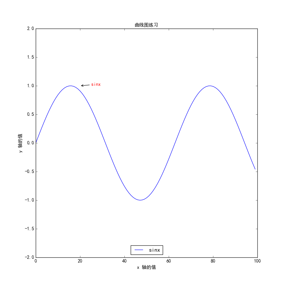
(2) Scatter plot
scatter() function is required for plotting scatterplots
If the two sets of data are limited, try using lists to represent them
For example, the height and weight data for five people are as follows:
height = [166, 171, 174, 182, 168]
weight = [52, 58, 61, 60, 55]
Use scatterplots to represent the weight-height relationship
height = [166, 171, 174, 182, 168]
weight = [52, 58, 61, 60, 55]
fig7, axes = plt.subplots(figsize=(10, 10), dpi = 300, facecolor = 'w')
axes.scatter(weight, height)
plt.xticks(range(50, 65, 1))
plt.yticks(range(165, 185, 2))
plt.xlabel('weight')
plt.ylabel('height')
plt.savefig('E:\Python\StudyOfMatplotlib\ Scatter plot')
plt.show()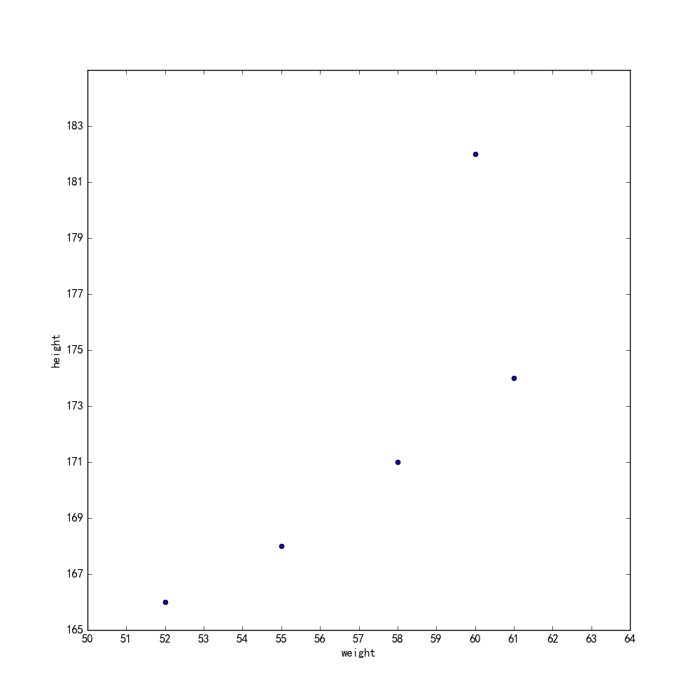 After setting the coordinate axis, you can see whether the drawn image is ideal.
Scatter plots can be used to analyze a large amount of data and facilitate data processing.
(3) Histogram
The histogram is a statistical report graph where area represents frequency and width represents group spacing, so height is frequency/group spacing
Histograms are drawn using the hist (data =, bins =, normed =, facecolor =, edgecolor =, alpha =) function
Data: Required parameters, drawing data
bins: Number of long bars in the histogram, optional, default to 10
Nored: Whether or not to normalize the resulting histogram vectors, optional, defaults to 0, which means no normalization, display frequency;Nored=1 for normalization, display frequency
facecolor: The color of the bar
edgecolor: The color of the long bar border
alpha:Transparency
a = np.random.randn(706)          #Generate a random sequence, why 706 self-guesses
plt.hist(a, facecolor = 'y', edgecolor = 'b', bins = 20, alpha = 0.5) #Draw the histogram directly and you're done
plt.xlabel('numerical value')
plt.ylabel('frequency/Group spacing')
plt.title('histogram')
plt.savefig('E:\Python\StudyOfMatplotlib\ histogram')
plt.show()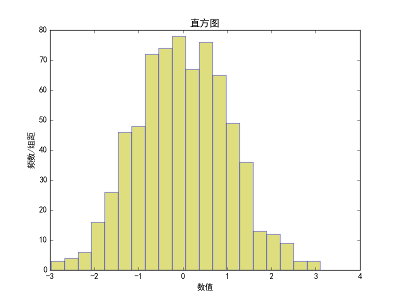
In fact, frequency/group spacing is frequency, so the vertical coordinates of the histogram are frequency. You can see that the random number column generated satisfies the normal distribution. Yes, the function used here to generate the random number will generate the normal distribution sequence.
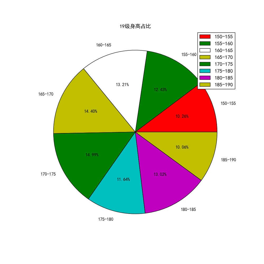
(4) Pie chart
To show the proportion of different types of statistics in the total, pie charts are a good way to meet this need
The function to draw the pie chart is plt.pie(x, labels=,autopct=,colors)
x: Quantity, automatic percentage
abels: name of each part
autopct: proportional display
colors: Each part of the color
Here we assume that we are counting the height of a grade student and using pie charts to show the distribution of the number of people in different high schools
fig7, axes = plt.subplots(figsize=(10, 10), dpi = 300, facecolor = 'w', edgecolor = 'b')   #Create Canvas
height1 = ['150-155', '155-160', '160-165', '165-170', '170-175', '175-180', '180-185', '185-190']
number = [52, 63, 67, 73, 76, 59, 66, 51]
plt.pie(number, labels = height1, autopct ='%1.2f%%', colors = ['r', 'g', 'w', 'y', 'g', 'c', 'm', 'y'])
plt.legend() #Add Legend
plt.title('19 Grade Height Percentage')
plt.savefig('E:\Python\StudyOfMatplotlib\ Pie chart')
plt.show()
When adding the name of each paragraph to the pie chart, don't forget to put single quotation marks on each element in the list
(5) Polar coordinate drawing
When subplot() is called to create a subgraph, you can create a polar subgraph by setting projection='polar', as described in the previous section on subgraph creation, and then draw a graph in the polar subgraph by calling plot().
Create a simple polar axis
fig8 = plt.figure(figsize=(10, 10), dpi = 300, facecolor = 'w', edgecolor = 'b')
plt.subplot(projection = 'polar')
plt.savefig('E:\Python\StudyOfMatplotlib\ polar coordinates')
plt.show()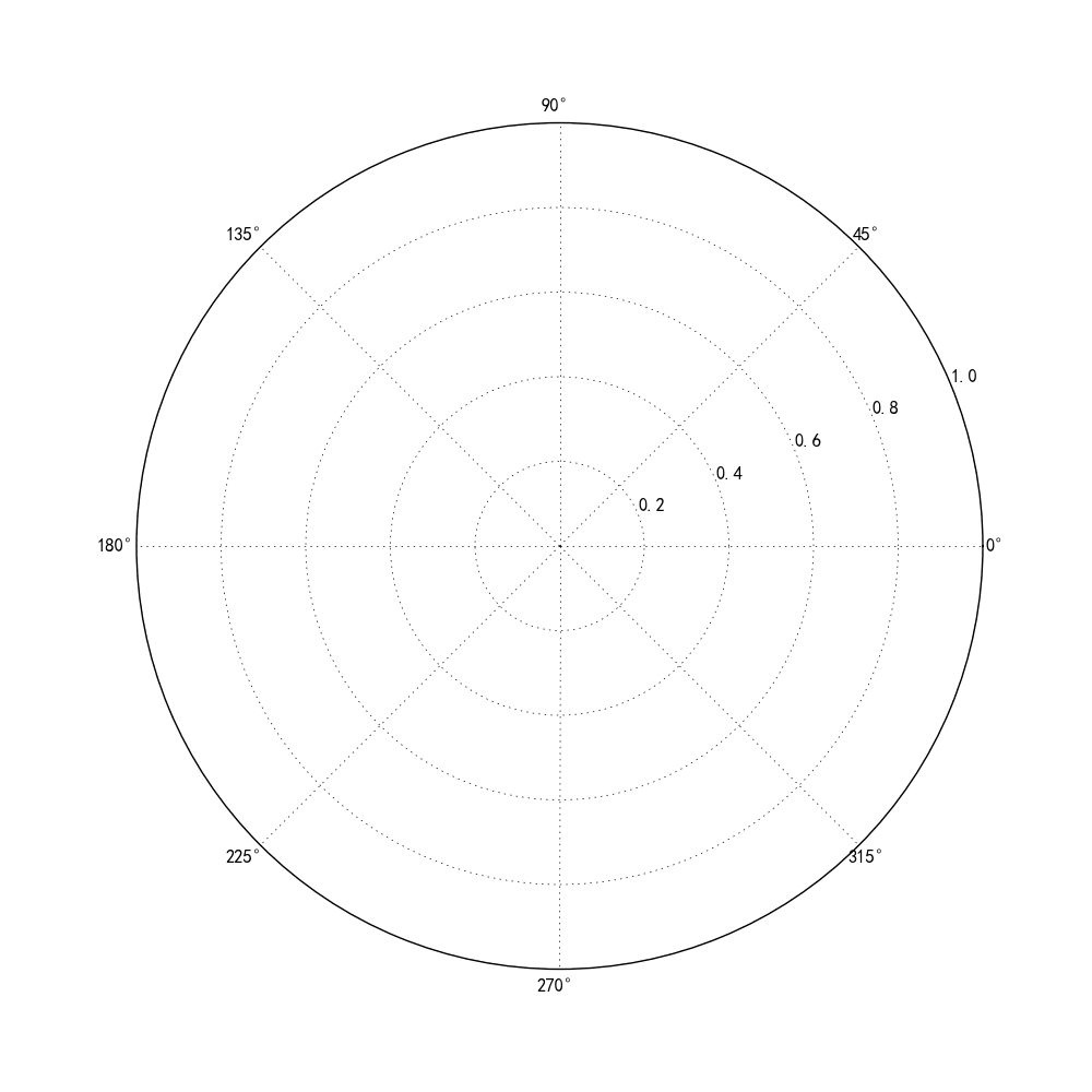
Some parameter settings in the polar axis
fig8 = plt.figure(figsize=(10, 10), dpi = 300, facecolor = 'w', edgecolor = 'b')
plt.subplot(projection = 'polar')
plt.direction(-1) # Set Counterclockwise to Positive
plt.thetagrids(np.arange(0.0, 360.0, 90), ['a', 'b', 'c', 'd']) #Angle setting
plt.rgrids(np.arange(0.2,2,0.4)) #jin'xing Settings for Polar Diameter
plt.savefig('E:\Python\StudyOfMatplotlib\ polar coordinates')
plt.show()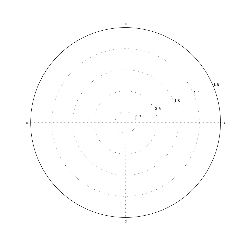 Comparing the code with the drawing shows that
When setting an angle, np.arange(0.0, 360.0, 90),[a, b, c, d] means that 0-360 is divided into four equal parts and labeled with the following letters. The same is true for the polar radius setting later.
Radar Mapping in Polar Coordinates
fig8 = plt.figure(figsize=(10, 10), dpi = 300, facecolor = 'w', edgecolor = 'b')
plt.subplot(projection = 'polar')
plt.direction(-1) # Set Counterclockwise to Positive
plt.thetagrids(np.arange(0.0, 360.0, 90), ['a', 'b', 'c', 'd']) #Angle setting
plt.rgrids(np.arange(0, 16, 2)) #jin'xing Settings for Polar Diameter
data1 = np.random.randint(1, 10, 10)
plt.plot(data1, color = 'r')
plt.fill(data1, alpha = 0.2, color = 'r')
plt.savefig('E:\Python\StudyOfMatplotlib\ polar coordinates')
plt.show()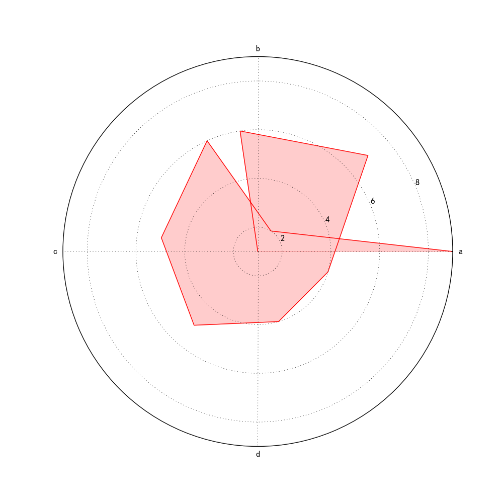 Image Drawing Using Random Numbers in Polar Coordinates
4.Style and Style
(1) Canvas settings
(2) Subgraph layout
(3) Color
(4) Style of lines and points
(5) Axis
(6) Scale
(7) Text
(8) Legend
(9) Grid settings
5.extend
(1) Mapping using BaseMap
(2) 3D Drawing Toolkit